Design System
Documentacion visual completa de NexVault. Todos los tokens, componentes y patrones usados en la landing page. Esta pagina sirve como referencia para exportar a Figma.
01 / Color Palette
Colors
Todos los colores estan definidos en tailwind.config.theme.extend.colors. Usa nombres semanticos, nunca hex directo.
Core Palette
Background
#0B0E14
bg-background
Surface
#151925
bg-surface
Primary
#6366F1
bg-primary / text-primary
Accent
#34D399
bg-accent / text-accent
Text Main
#F8FAFC
text-text-main
Text Muted
#94A3B8
text-text-muted
Gradients
Primary Gradient — linear-gradient(135deg, #6366F1, #34D399)
Uso: .text-gradient, highlights, decoracion
Button Gradient — linear-gradient(135deg, #6366F1, #4F46E5)
Uso: .btn-primary
Opacity Scale (Borders & Overlays)
Accesibilidad
Text Main (#F8FAFC) sobre Background (#0B0E14)
Ratio: 17.4:1 — AAA Pass
Text Muted (#94A3B8) sobre Background (#0B0E14)
Ratio: 7.5:1 — AAA Pass
02 / Typography
Tipografia
Dos fuentes de Google Fonts. Space Grotesk para titulos (tech, moderna). Inter para cuerpo (legible, datos financieros).
DISPLAY FONT
Space Grotesk
Weights: 400, 500, 600, 700
Tailwind: font-display
AaBbCcDd 0123456789
BODY FONT
Inter
Weights: 300, 400, 500, 600, 700
Tailwind: font-body
AaBbCcDd 0123456789
Type Scale
H1 — 4.5rem/72px
font-display bold
Reimagined
H2 — 3rem/48px
font-display bold
Section Title
H3 — 1.25rem/20px
font-display semibold
Card Heading
Body — 1rem/16px
font-body regular
NexVault is the next-generation e-wallet that combines military-grade security with lightning-fast transactions.
Small — 0.875rem/14px
font-body, text-muted
256-bit AES encryption, biometric auth, and real-time fraud detection.
Caption — 0.75rem/12px
font-body, uppercase
Why NexVault
Stat — 3rem/48px
font-display bold
$2.4B
03 / Spacing
Espaciado
Basado en la escala de Tailwind (multiplos de 4px). Consistente en todo el proyecto.
p-1 / gap-1
p-2 / gap-2
p-3 / gap-3
p-4 / gap-4 — padding de cards internas
p-6 / gap-6 — padding principal, gap entre cards
p-8 / gap-8 — gap entre secciones internas
py-12 — padding vertical de secciones menores
py-24 — padding vertical de secciones principales
py-32 — padding vertical en desktop (lg:py-32)
04 / Components
Componentes
Buttons
Glass Cards
glass-card
Glassmorphism con backdrop-blur, borde sutil, hover lift. Usado en features y testimonials.
glass-card-lg
Version grande con mas padding y blur. Usado en stats y CTA.
Badges & Pills
Icon Containers
Avatar Stack
12,000+ users
joined this month
Navbar
Estado: Default (transparent). Al hacer scroll aplica .navbar-scrolled con blur y fondo.
05 / Effects & Animations
Efectos
Gradient Text
Reimagined.
Clase: .text-gradient
CSS: background-clip: text con gradiente primary→accent
Glassmorphism
Contenido con blur de fondo
backdrop-filter: blur(16px) + borde rgba(255,255,255,0.06)
Glow Effect
Glow behind elements
box-shadow: 0 0 20px rgba(99,102,241,0.3) o blur absoluto
Scroll Reveal
Elementos aparecen al entrar en viewport
Clase: .reveal → .reveal.visible
Transition: 0.8s cubic-bezier(0.16, 1, 0.3, 1)
Transform: translateY(30px) → translateY(0)
Grain Overlay
SVG noise filter al 3% de opacidad. Agrega textura sutil al fondo.
Marquee
Scroll infinito horizontal para logos de partners
Clase: .marquee + .marquee-content
Animation: 20s linear infinite
06 / Assets & Images
Imagenes Generadas
Generadas con Nano Banana 2 (Gemini Flash Image). Estilo: 3D Render, High Tech, Glossy & Minimal.
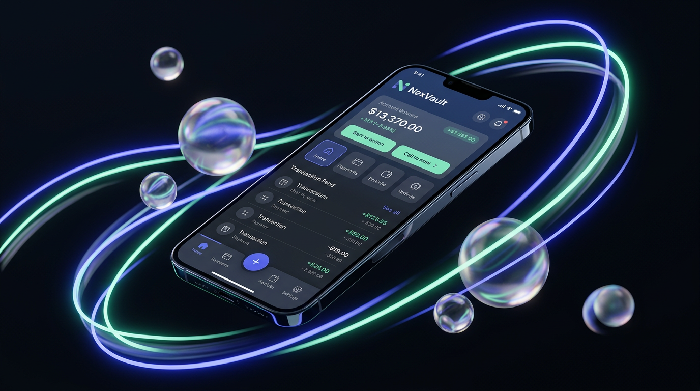
Hero Image
hero.png — 16:9

Feature: Security
feature-security.png
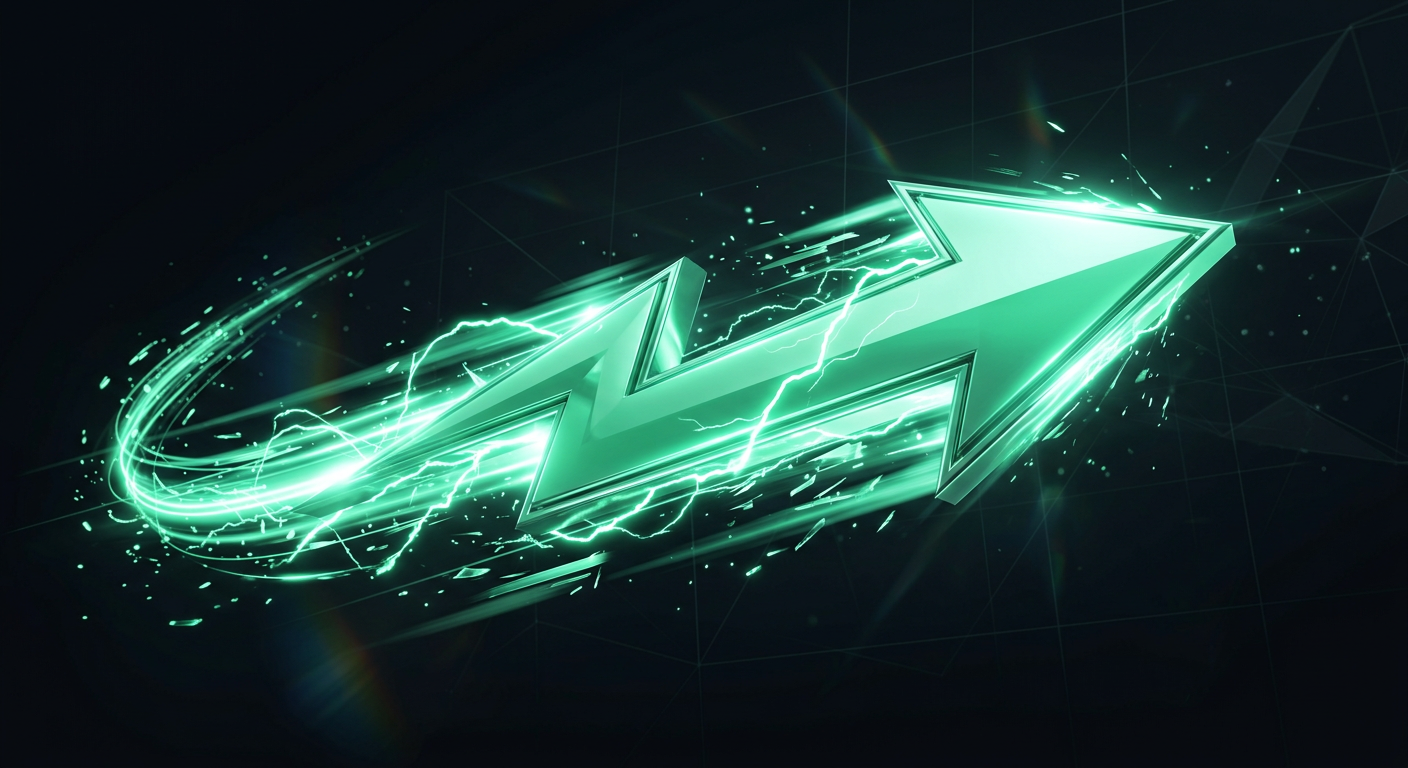
Feature: Speed
feature-speed.png

Feature: Global
feature-global.png
Logo
07 / Grid & Layout
Grid System
Breakpoints
Column Layouts
Features / Testimonials: grid md:grid-cols-3 gap-6
Stats: grid sm:grid-cols-2 lg:grid-cols-4 gap-8
Hero: grid lg:grid-cols-2 gap-12
Footer: grid sm:grid-cols-2 lg:grid-cols-4 gap-12
08 / Notas para Figma
Exportacion a Figma
Color Styles
- Crear 6 color styles en Figma con los mismos nombres:
background,surface,primary,accent,text-main,text-muted- Agregar los gradientes como estilos separados
Text Styles
- H1: Space Grotesk Bold 72px
- H2: Space Grotesk Bold 48px
- H3: Space Grotesk Semibold 20px
- Body: Inter Regular 16px
- Small: Inter Regular 14px
- Caption: Inter Semibold 12px uppercase
Componentes
- Crear como componentes de Figma:
- Button/Primary, Button/Secondary, Button/Small
- Card/Glass, Card/Glass-LG
- Badge/Status, Badge/Tag
- Icon/Container, Icon/Step
- Avatar/Stack
- Navbar/Default, Navbar/Scrolled
Estructura HTML
- Cada seccion del HTML esta marcada con:
<!-- SECTION: Nombre -->- Secciones: Navbar, Hero, Marquee, Features, How It Works, Stats, Testimonials, CTA, Footer