Color Palette
#00D26A
Primary Green
Botones principales, CTA, acentos
AA Pass
#00B359
Primary Dark
Hover states, pressed
AA Pass
#FF6B35
Accent Orange
Badges, destacados, alertas
AA Pass
#1A1A1A
Secondary Dark
Texto principal, fondos oscuros
AAA Pass
#2D2D2D
Secondary Light
Cards oscuras, hover en dark
AAA Pass
#F5F5F5
Neutral Light
Fondos de sección, cards
Not for text
#666666
Text Light
Texto secundario, descripciones
AA Pass
#FFFFFF
White
Fondos, texto sobre oscuro
Not for dark bg
Typography Scale
Font Family: Inter (Google Fonts) — Weights: 300, 400, 500, 600, 700, 800, 900
Hero Title
H1 / Hero
64px (4rem)
Weight: 900 (Black)
Line-height: 1.1
Use: Hero headlines
Section Title
H2 / Section
48px (3rem)
Weight: 800 (ExtraBold)
Line-height: 1.2
Use: Section headings
Large Title
H3 / Large
40px (2.5rem)
Weight: 800 (ExtraBold)
Line-height: 1.2
Use: Solution titles
Card Title
H4 / Card
24px (1.5rem)
Weight: 700 (Bold)
Line-height: 1.3
Use: Card headings, feature titles
Body text large for hero descriptions and important paragraphs that need more presence.
Body Large
20px (1.25rem)
Weight: 400 (Regular)
Line-height: 1.7
Use: Hero descriptions
Body text is the standard paragraph style used throughout the site for descriptions and content.
Body
16px (1rem)
Weight: 400 (Regular)
Line-height: 1.6
Use: General content
Section Tag
Label / Tag
14px (0.9rem)
Weight: 700 (Bold)
Letter-spacing: 2px
Use: Section labels
Small text for captions, metadata, and supporting information.
Small
13.6px (0.85rem)
Weight: 500 (Medium)
Line-height: 1.5
Use: Captions, metadata
Spacing System
Based on 4px grid. Use these values for margins, padding, and gaps.
space-1
4px (0.25rem)
space-2
8px (0.5rem)
space-3
12px (0.75rem)
space-4
16px (1rem)
space-6
24px (1.5rem)
space-8
32px (2rem)
space-12
48px (3rem)
space-16
64px (4rem)
space-24
96px (6rem)
space-32
128px (8rem)
Components Gallery
Buttons
<button class="btn-primary">Text</button>
<button class="btn-secondary">Text</button>
<button class="btn-nav">Text</button>
Problem Card
Sin Tiempo
No alcanzas a preparar comidas saludables.
<div class="card-problem">
  <div class="card-icon">⏱️</div>
  <h3>Title</h3>
  <p>Description</p>
</div>
Step Card
1
Elige tu Plan
Selecciona según tus objetivos.
<div class="card-step">
  <div class="step-number">1</div>
  <h3>Title</h3>
  <p>Description</p>
</div>
Pricing Card
Más Popular
Plan Fit
S/55/día
<div class="card-pricing featured">
  <div class="pricing-badge">Popular</div>
  <h3>Plan Name</h3>
  <div class="pricing-amount">$55</div>
</div>
Testimonial Card
LC
"Las comidas llegan perfectas para mi rutina."
<div class="card-testimonial">
  <div class="testimonial-header">
    <div class="testimonial-avatar">LC</div>
    <div class="testimonial-meta">...</div>
  </div>
  <p class="testimonial-text">...</p>
</div>
Feature Item
Comidas Preparadas
Listas para consumir.
<div class="feature">
  <div class="feature-icon">🥗</div>
  <div class="feature-text">
    <h4>Title</h4>
    <p>Description</p>
  </div>
</div>
Tags & Badges
Section Tag
🔥 Popular
Featured
<span class="section-tag">Label</span>
<span class="hero-badge">🔥 Badge</span>
<span class="pricing-badge">Featured</span>
Stats
+500
Atletas activos
<div class="stat">
  <span class="stat-number">+500</span>
  <span class="stat-label">Label</span>
</div>
Icons
Native emoji icons used throughout the site. No icon library dependency.
⏱️
Time
🍔
Fast Food
🧮
Calculator
😰
Stress
🥗
Salad
📊
Chart
🚚
Delivery
🔥
Fire
⭐
Star
✅
Check
🍽️
Dining
📱
Mobile
Assets
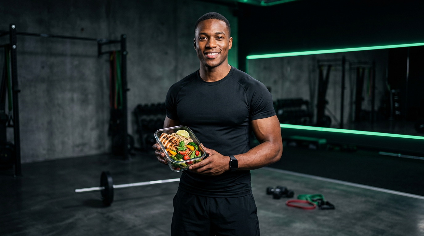
Hero Main Image
src/images/hero-gym-meal.png
Grid & Layout
Container
Max-width: 1400px (hero) / 1200px (content)
Padding: 0 2rem
Padding: 0 2rem
Grid Columns
1/4
1/4
1/4
1/4
1/3
1/3
1/3
1/2
1/2
Breakpoints
| Breakpoint | Width | Description |
|---|---|---|
| Mobile | 375px | Phones portrait |
| Tablet | 768px | Tablets portrait |
| Laptop | 1024px | Small laptops |
| Desktop | 1440px | Full desktop |