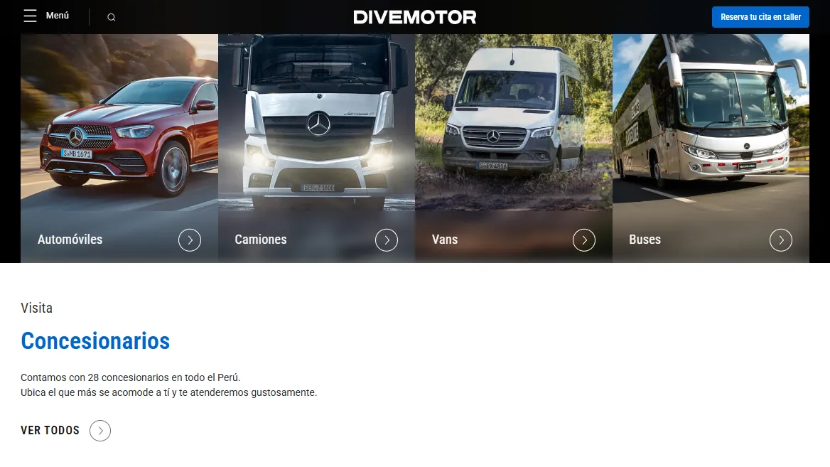
One portal, six brands, four vehicle lines
Divemotor is a large Peruvian automotive group. Its portal has to serve very different people at once: a fleet manager comparing sixteen truck models, a family looking for a Jeep, a driver booking a service at the nearest workshop. All of it inside one Divemotor shell, with each brand’s content in its own voice.
A portal like that is never finished. My job was to keep it improving without taking it offline: find where people got lost, design the fix, and hand it to development in a form they could ship.
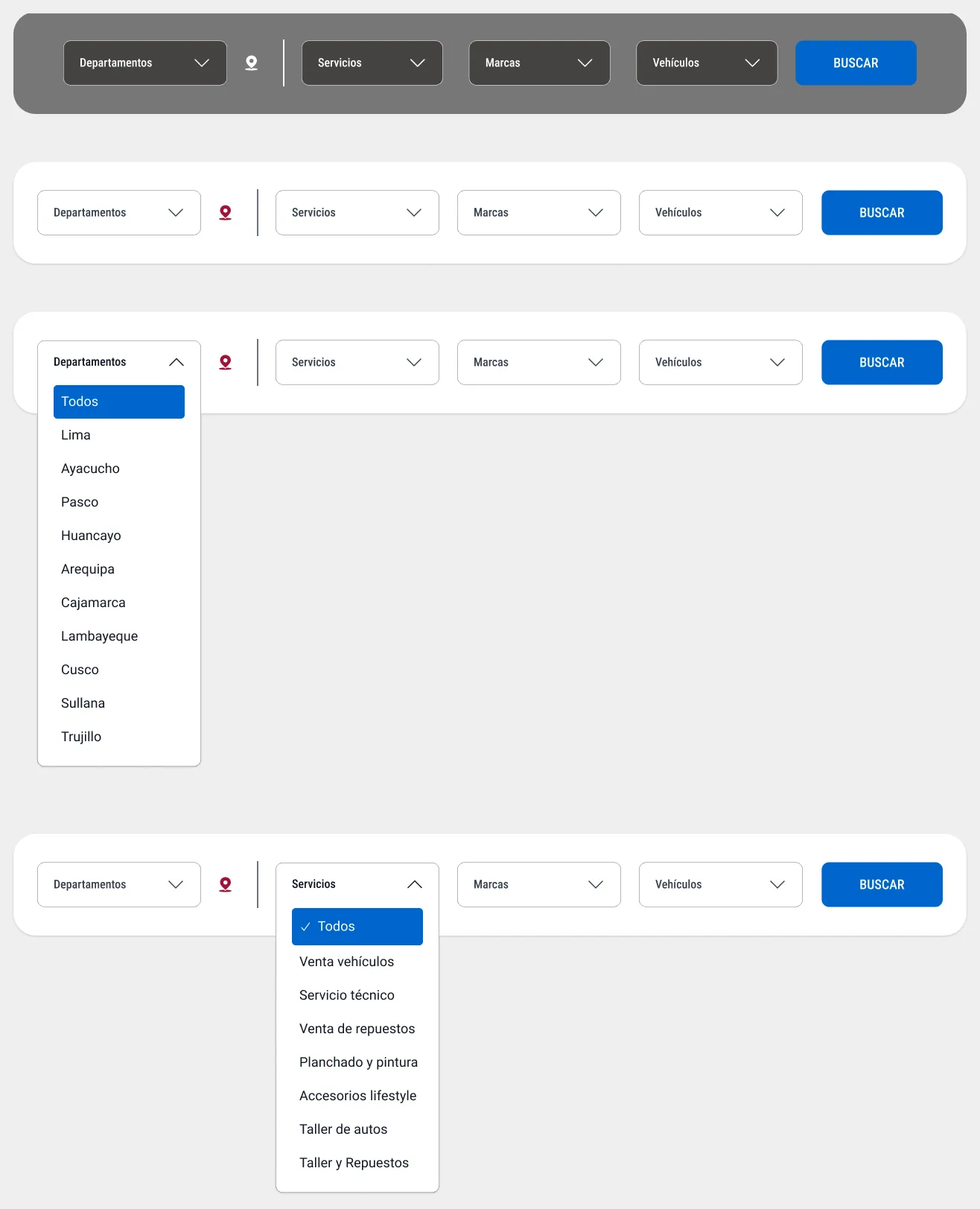
Finding a dealer shouldn’t need a map-reading lesson
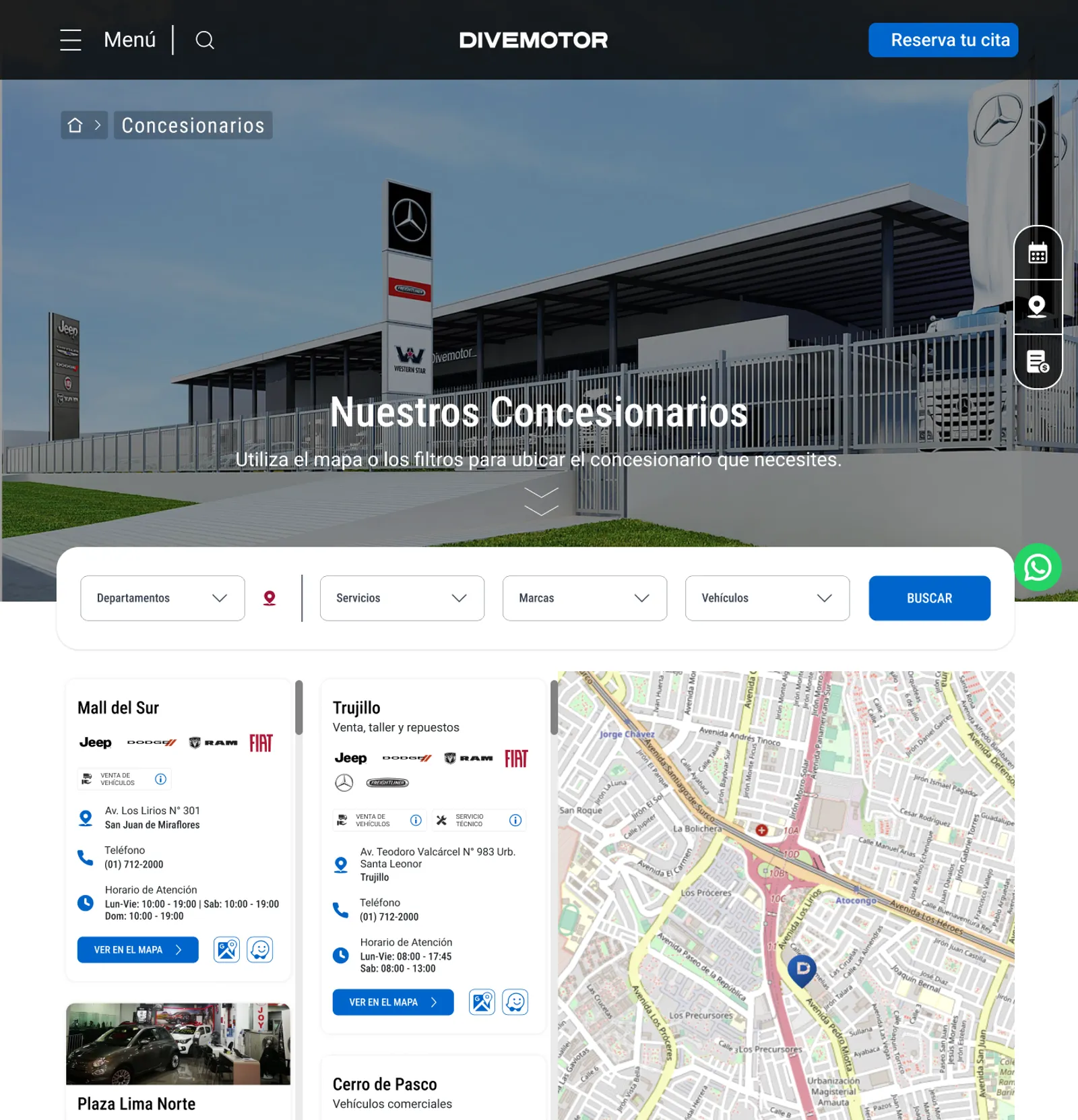
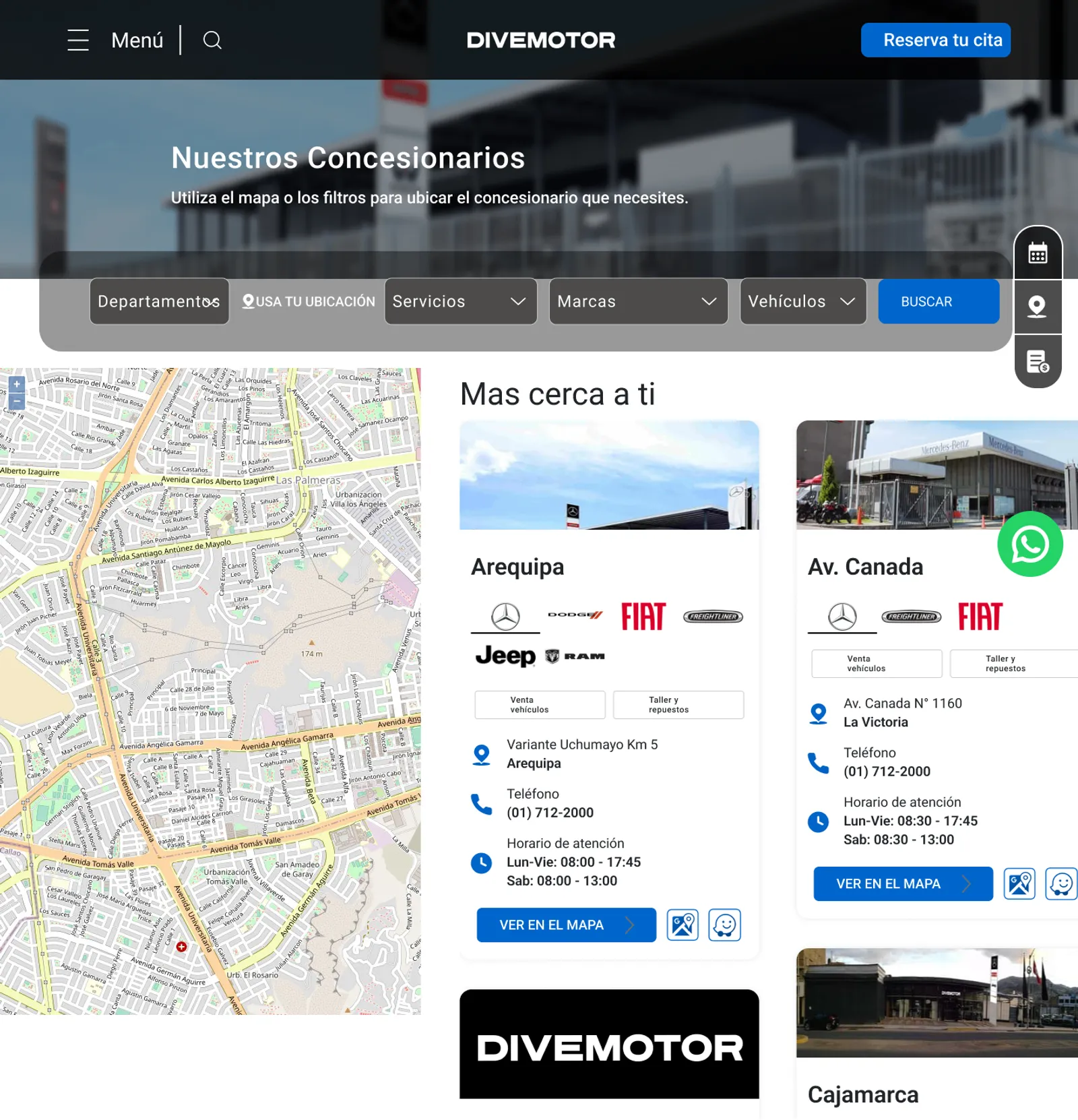
The Dealerships page was the clearest case. The filters floated over the hero photo, half of them hard to read, and the map took the whole left side before you had chosen anything.
Drag the red line, or focus it and use the arrow keys.
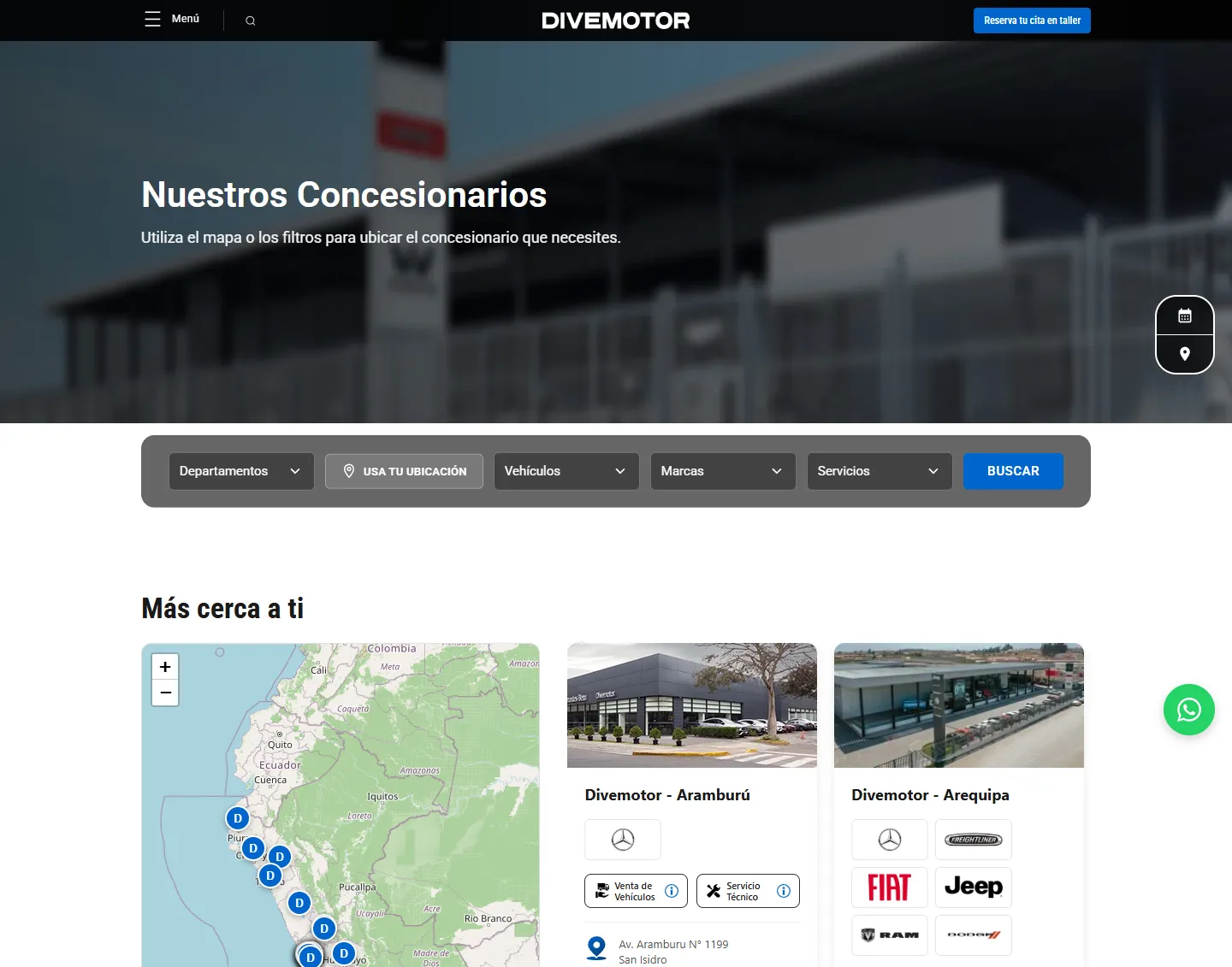
The filter card shipped: today the live page leads with it, including “use your location”, so the nearest dealer is one tap away.
The sections the brand was missing
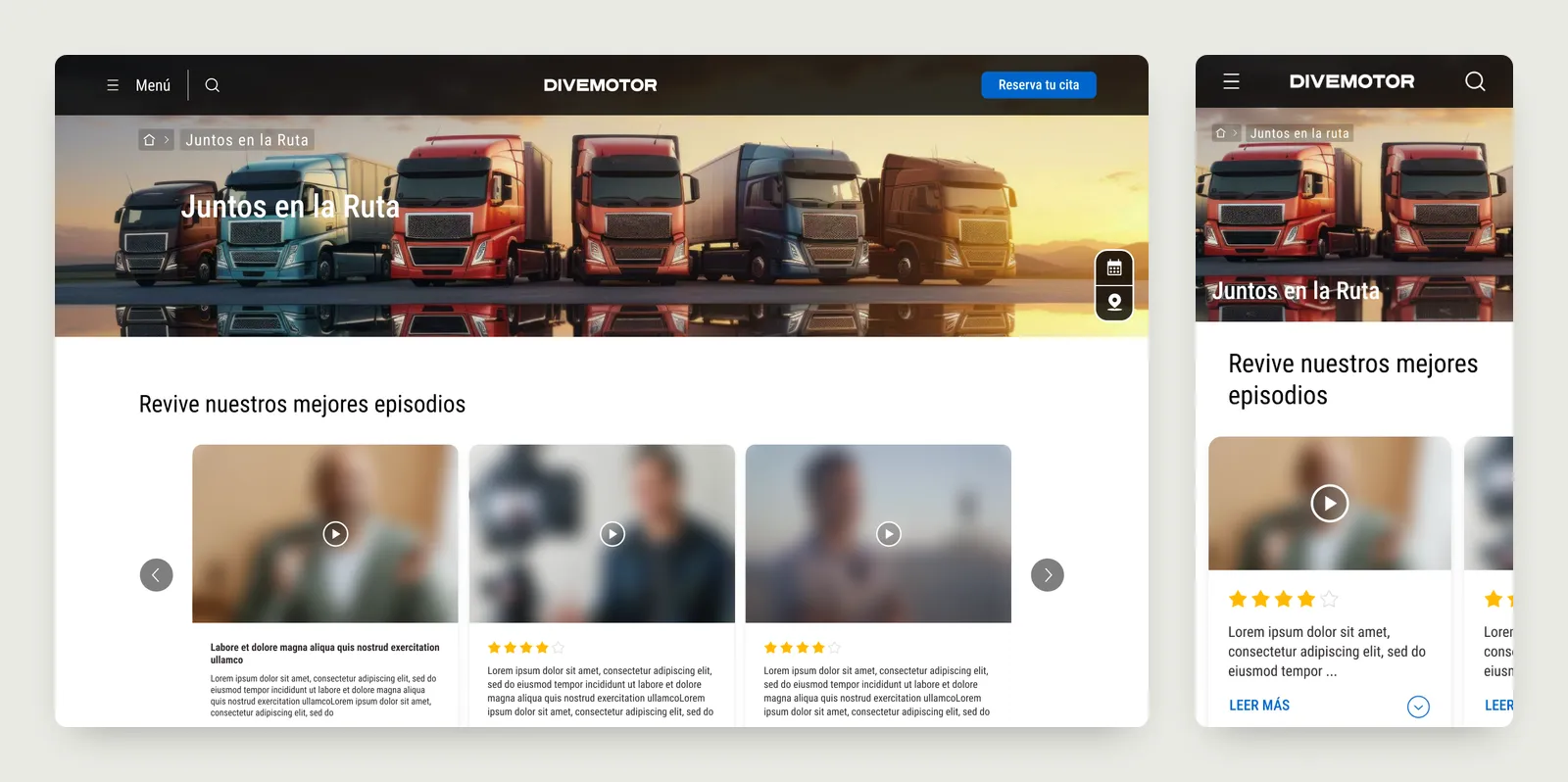
Divemotor had stories the portal couldn’t tell: drivers and clients on the road, vehicle deliveries, its sustainability work. I designed the sections for them, desktop and mobile, each with its own components: a video series called Juntos en la Ruta, a customer experiences section, and an article layout that became the sustainability page. All three are live.
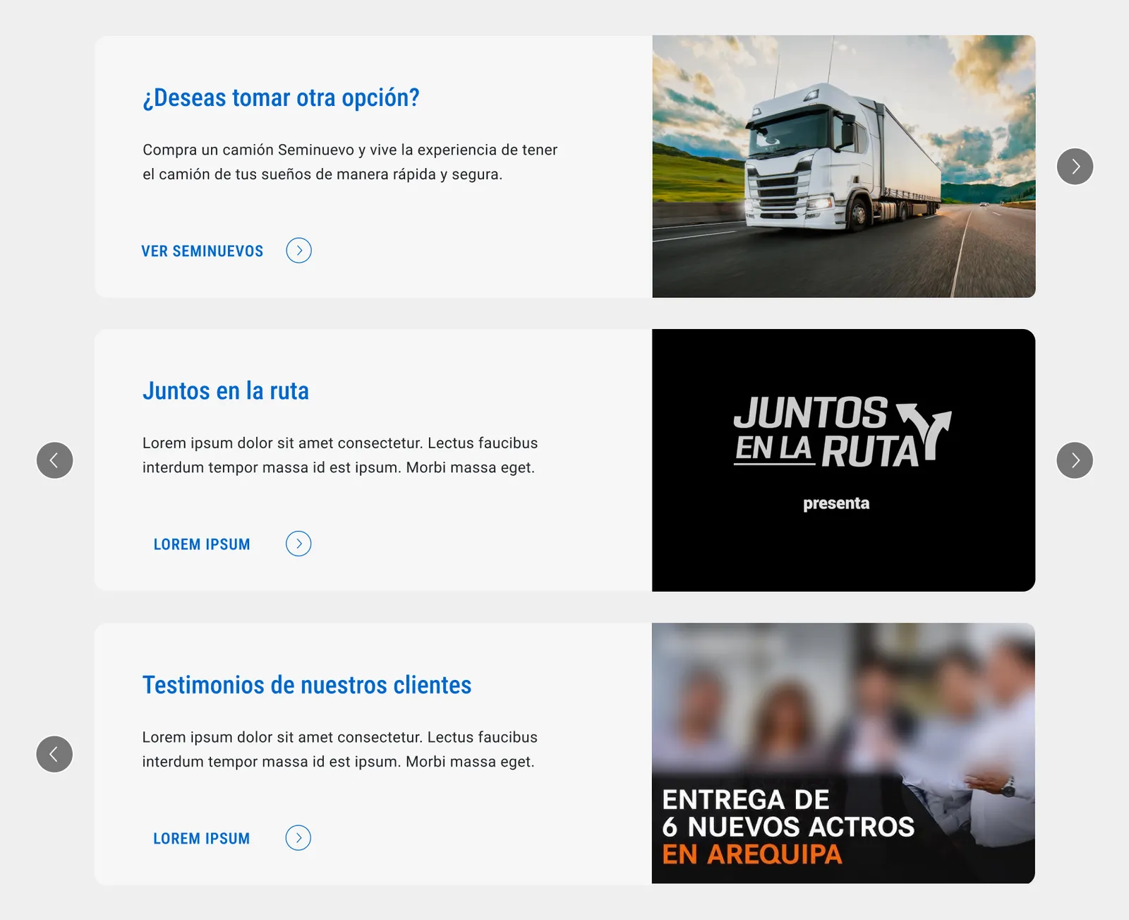
Inside the trucks listing, I added banner sliders that offer a next step when a buyer hasn’t found the right model: used trucks, the video series, or what other clients say.
One kit behind every page
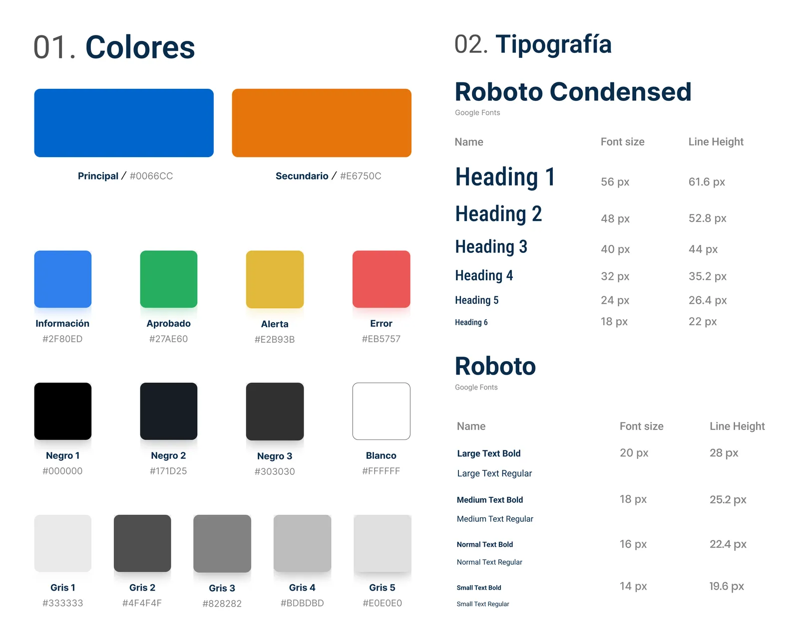
A portal this size only stays consistent if every page is built from the same parts. I built the UI kit as that source: colours, type, and components grouped in the same sections as the site, so a designer or developer finds the header, a filter or a brand tab where they expect it.
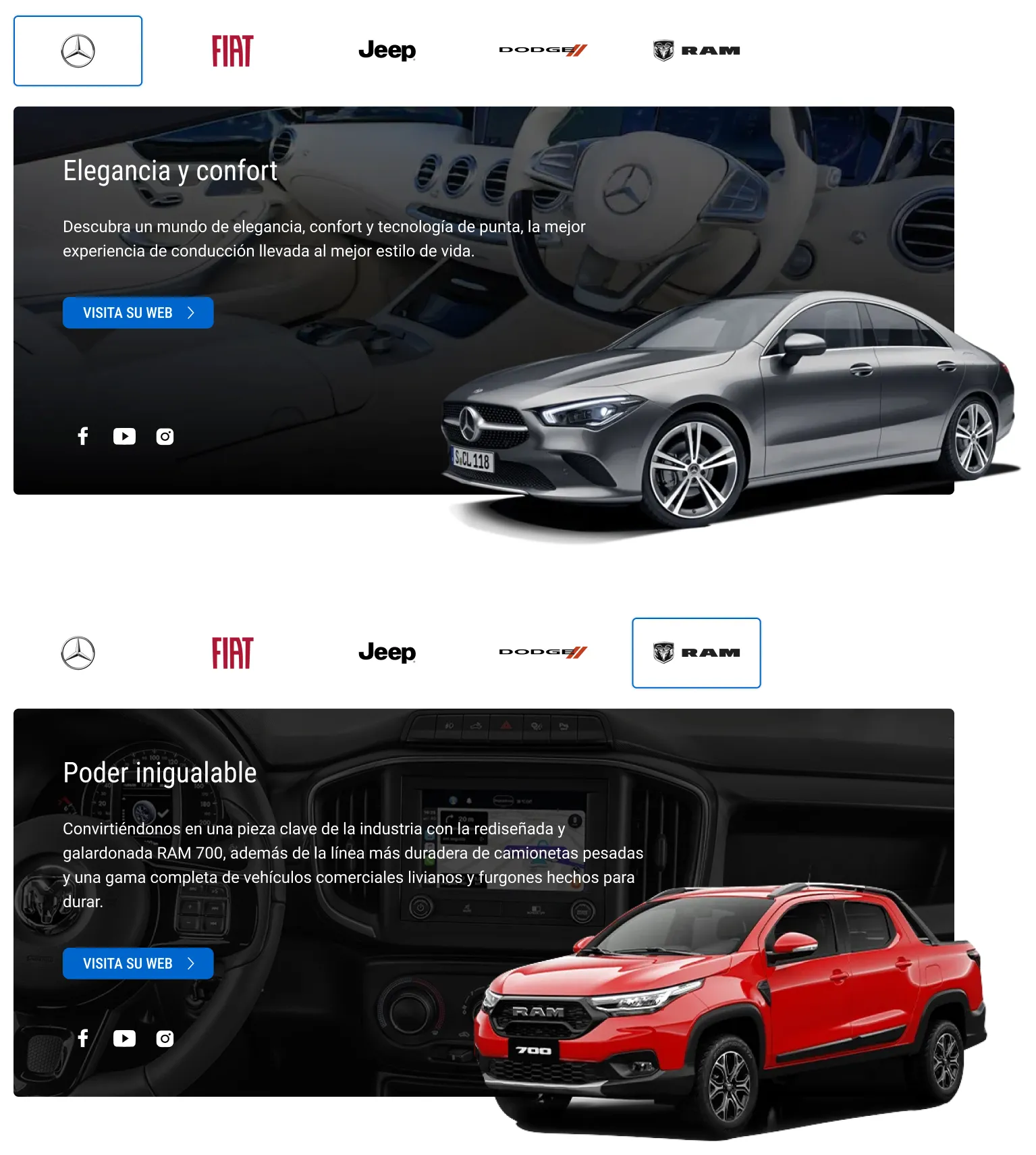
Brands don’t get their own theme; they get their own content inside the same shell. A brand tab is one component with a variant per brand, so adding a brand never means designing a new page.
Specs developers could build from
Most portal changes are small, and small changes get lost in handoff. So I kept a page in Figma just for the development team: the layout at every breakpoint from 1920 down to mobile, and next to it, in plain words, what changes and why.
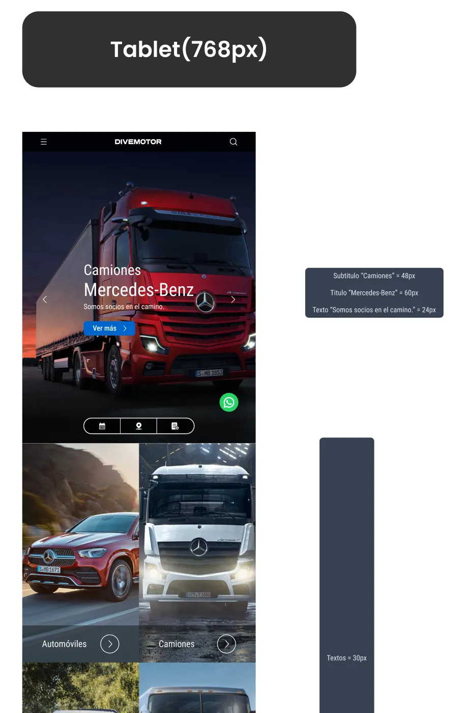
That note is now the live home: four vehicle lines, no gap.
- new sections designed and live
-
3 - breakpoints specified for development
-
6 - brands inside one portal shell
-
6 - component sets in the UI kit I built
-
87
What I learned
On a live portal, improvement is a habit, not a launch. The changes that shipped were the ones I wrote down where developers already look, with the reason next to them.
Not everything shipped as drawn. The sidebar filter I proposed for buses went live as a simpler brand filter. That taught me to design the version that can ship this sprint next to the ideal one, and to let the team choose with both on the table.