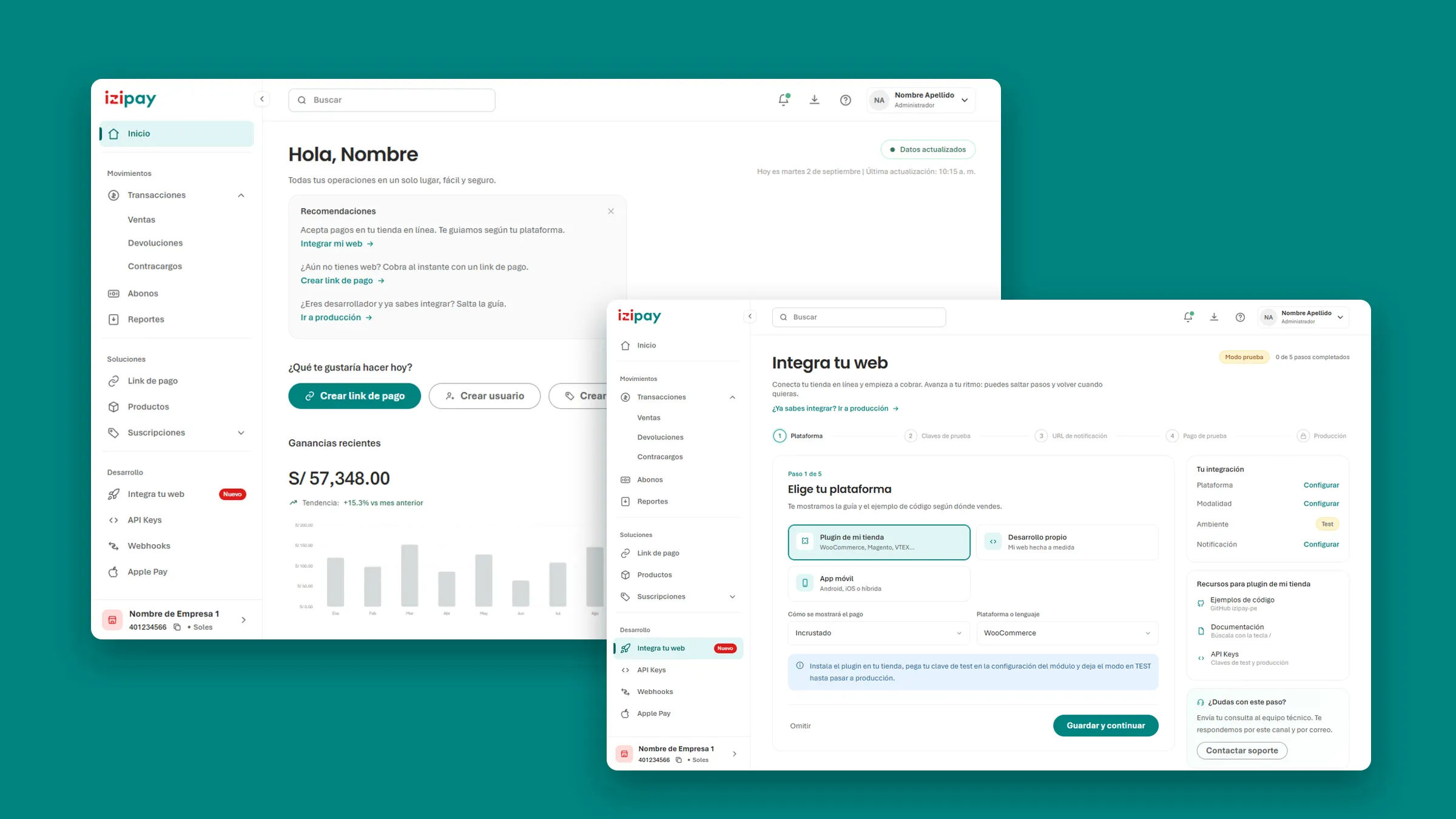
A panel that had grown one screen at a time
Izipay’s merchant panel did its job, but every section had been built on its own: its own filters, its own spacing, its own way of showing a status. Merchants felt it as friction, and the team felt it on every handoff, because the Figma file no longer described the product that shipped.
So I started with the look and feel, on a real screen. Sales is where merchants spend their day, and it shows the whole change at once.
Drag the red line, or focus it and use the arrow keys.
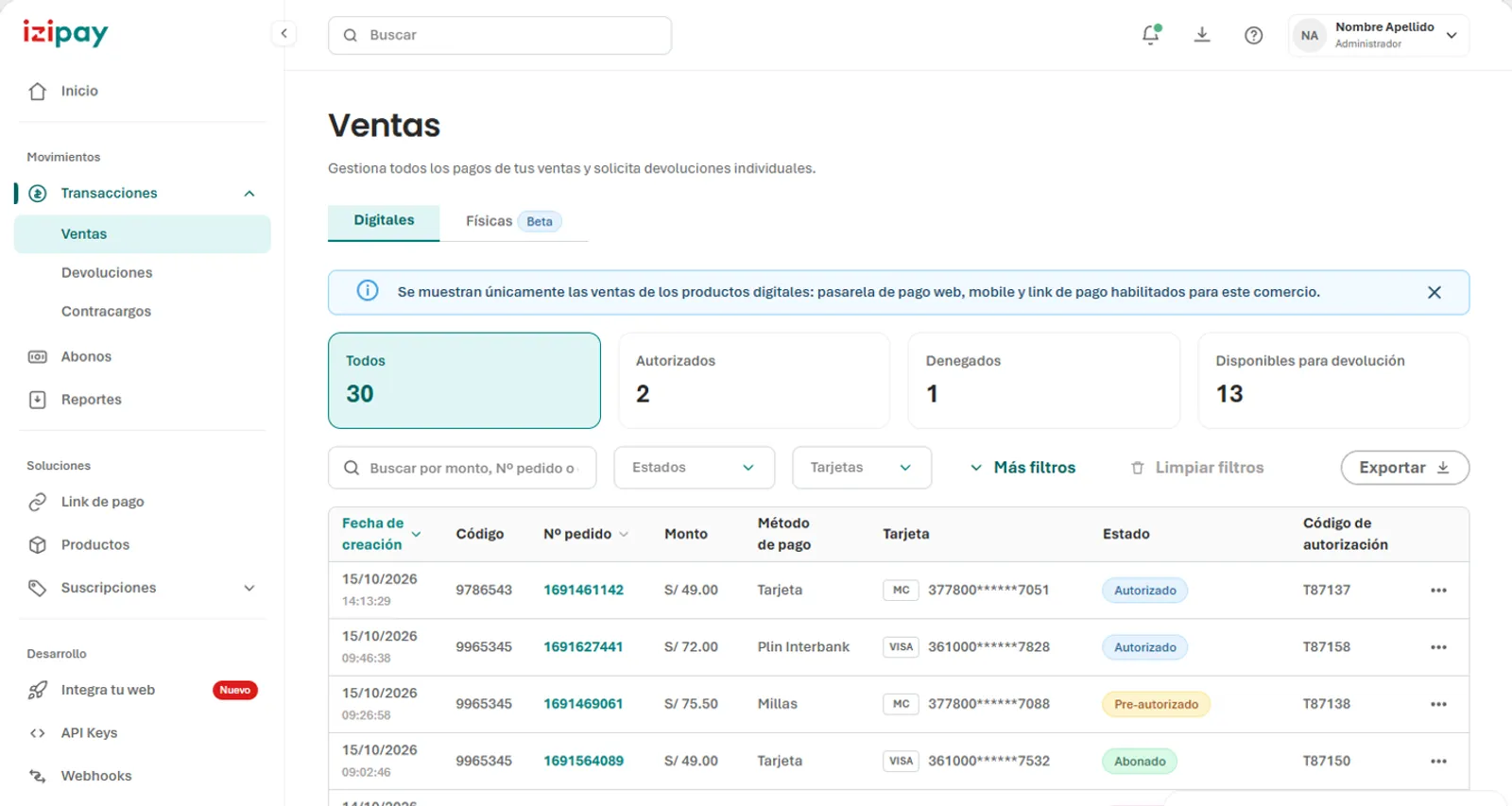
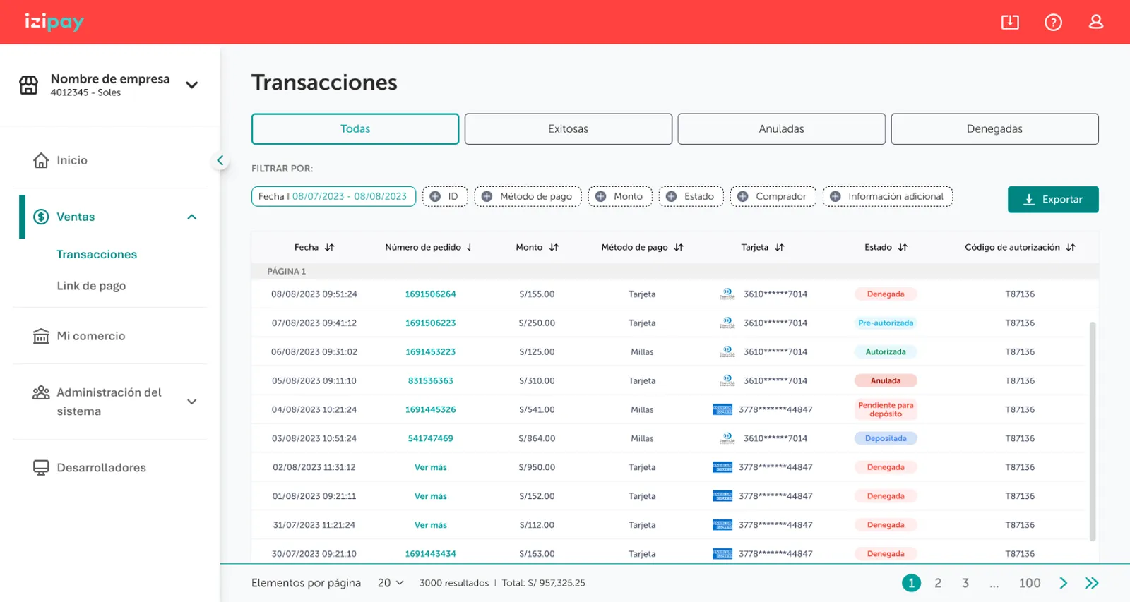
The rules behind it are few, and every screen follows them:
- One type system. Aptos for everything a merchant reads or types, and Poppins only for headings of 20 px and up.
- One primary colour. Izipay’s teal marks the main action and the current place; nothing else competes with it.
- One filter pattern. Every list filters the moment you touch a control, with no Apply button.
- The merchant’s words. “Order no.” instead of an internal sale ID; status counts instead of bare tabs.
Figma, then code, then Figma again
A new look and feel only lasts if the team can keep building it. I started where the team designs: in the DS | Panel 2026 file, I designed the new parent components in Figma, each with every state and size it needs. Input Text alone covers seven states, from default to error and completed, in four sizes.
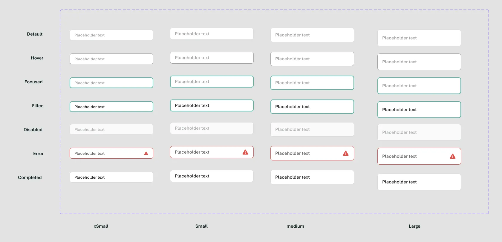
Then I took the components to code, where real interactions show what a static frame can’t. Filters should react the moment you touch them. A tooltip needs room to be read. I adapted and improved each component there, and when a flow worked in the browser, I brought it back into Figma, so the file shows the product as it really behaves.
What held the round trip together was a naming rule. A token’s code name is its Figma name in lowercase, with slashes and spaces turned into dashes, so designers and developers use the same word for the same value.
Figma
Code
color/neutral/darkest 900
--color-neutral-darkest-900
text/body/base/bold
--text-body-base-bold
Button · Primary · Small
.button.button--primary.button--small
Components follow the same idea: each Figma property becomes a modifier, so Button · Primary · Small is .button.button--primary.button--small in code.
Documented where both sides look
A system nobody can find is a system nobody follows. I documented it as a living catalogue, rendered with the panel’s own stylesheet, so if something changes there, it changes in the panel too. It covers 58 sections: foundations, components with all their states, the pieces each flow needed, navigation and the onboarding.
Every component also records where it deliberately differs from Figma, and why. A few examples:
- Tooltips grow up to 240 px wide instead of a fixed 80, so their text can be read.
- Filter bars stay at 40 px instead of 36, to keep a comfortable touch target.
- The close “x” is teal, not red, because red reads as an error.
The first flow on the new system
With the system in place, the first flow to use it was the one Izipay needed most. Connecting an online store depended on personalized support, and that doesn’t scale to thousands of small merchants. In the previous panel, everything a developer needed lived in one Developers screen with two tabs.
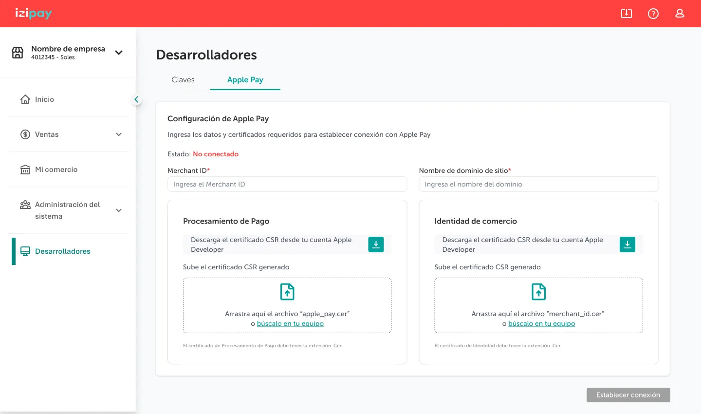
I mapped the integration journey end to end and studied how other payment platforms onboard developers. Stripe’s setup guide was the clearest reference, minus its focus mode.
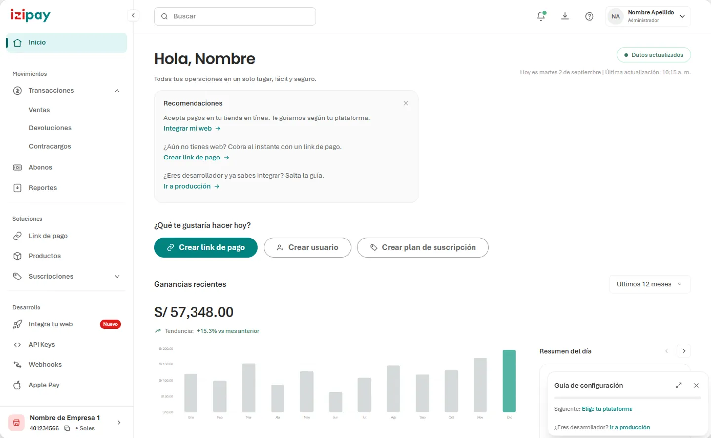
The home now suggests the next step instead of demanding it: integrate your website, create a payment link if you don’t have a website yet, or go straight to production if you already know how.
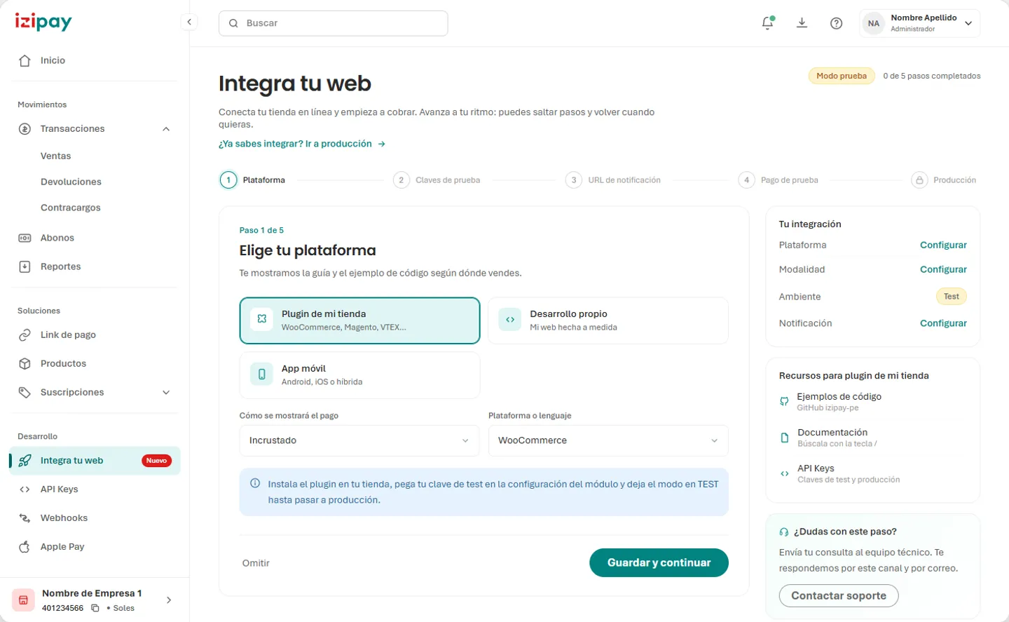
Integrate your website breaks the job into five steps in two groups. First, test your integration: choose your platform, get your test keys, set one notification URL and make a test payment. Then turn on production, which stays locked until the tests pass. Any step can be skipped and resumed.
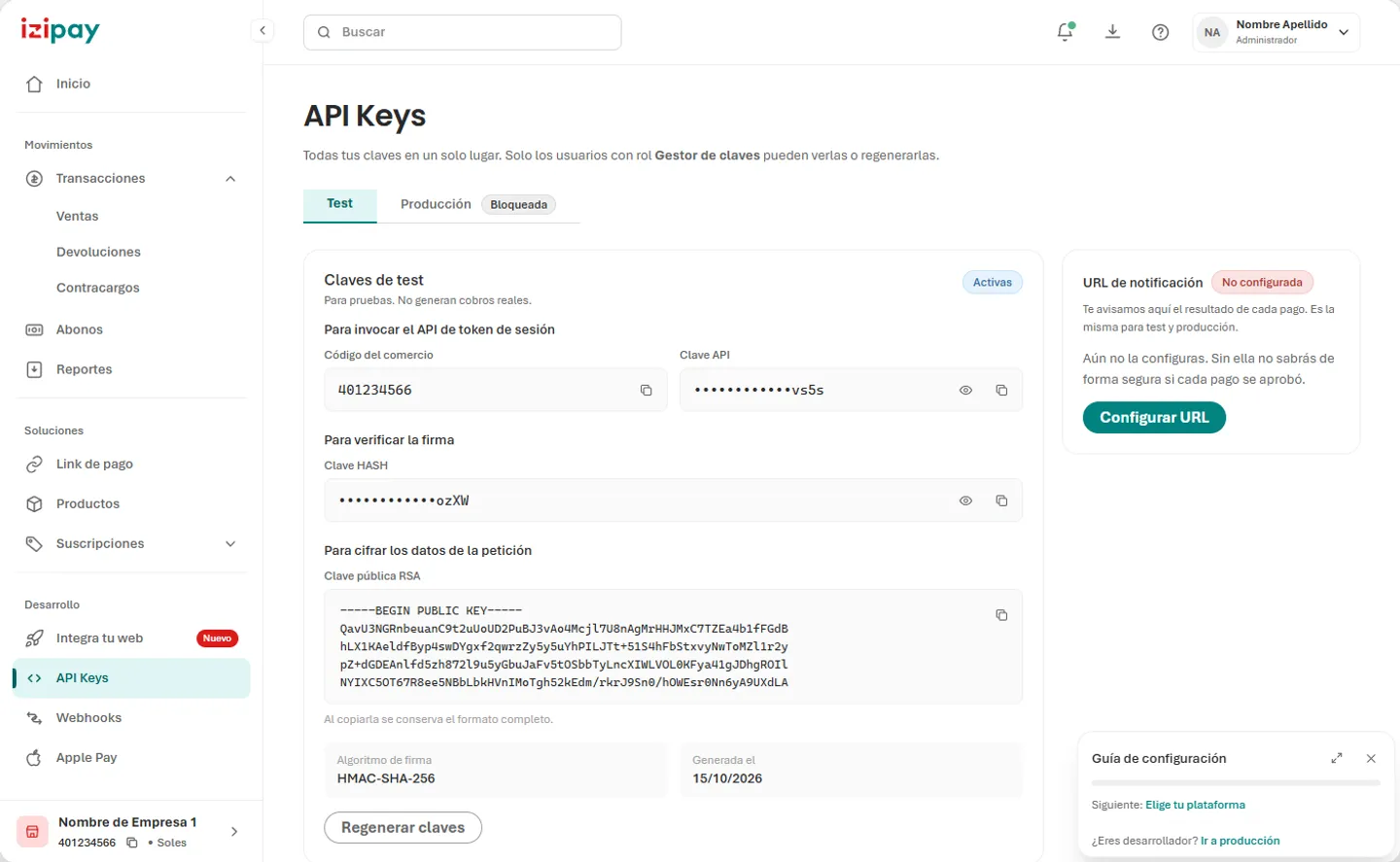
Developers now get four focused screens instead of one: Integrate your website, API Keys, Webhooks and Apple Pay. In API Keys, test and production live on separate tabs, and every key is grouped by what it’s used for.
What the team builds on now
- screens rebuilt on the new look and feel, checked at 1440 and 375 px
-
23 - design tokens, each named after its Figma style
-
277 - parent components, with every state
-
17 - sections documented in the living catalogue
-
58
I delivered the prototype, the design system and its documentation to the UX/UI team and to development as the base for the new panel. It’s still a prototype, so there are no live metrics yet.
What I learned
A design system isn’t finished when it’s drawn. It’s finished when it survives real use. Taking the components from Figma to code and back taught me to treat handoff as a loop, not a one-way delivery: every decision made in the browser has to find its way back into the design file, under the same name, or the two drift apart again.
I also learned that a new look and feel is only as strong as its documentation. Writing down why a component differs from Figma is what stops the next person from “fixing” it back.