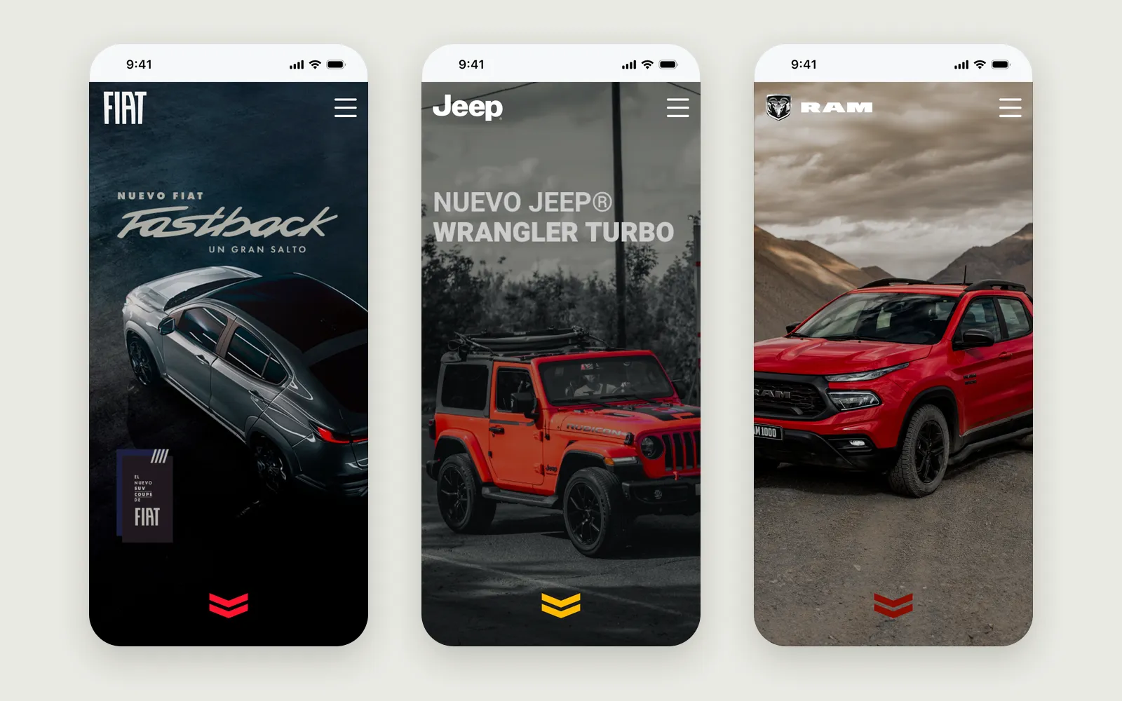
The car is right there. The information isn’t.
In a showroom, the questions come at the car: what colours does it come in, how safe is it, what engine does it have? The answers lived in brochures, on brand websites built for a different moment, or with an advisor who might be busy with someone else.
Divemotor asked for every vehicle on the floor to answer for itself. A visitor scans a QR code at the car, and the model opens on their phone: its design, safety, performance, comfort and technology, in the brand’s own look.
Five sections, in the words buyers use
The brief listed what each model had to cover. I mapped every item to a card, so nothing in the brief was left without a place, and renamed “Mechanics” to “Performance”, the word buyers actually use.
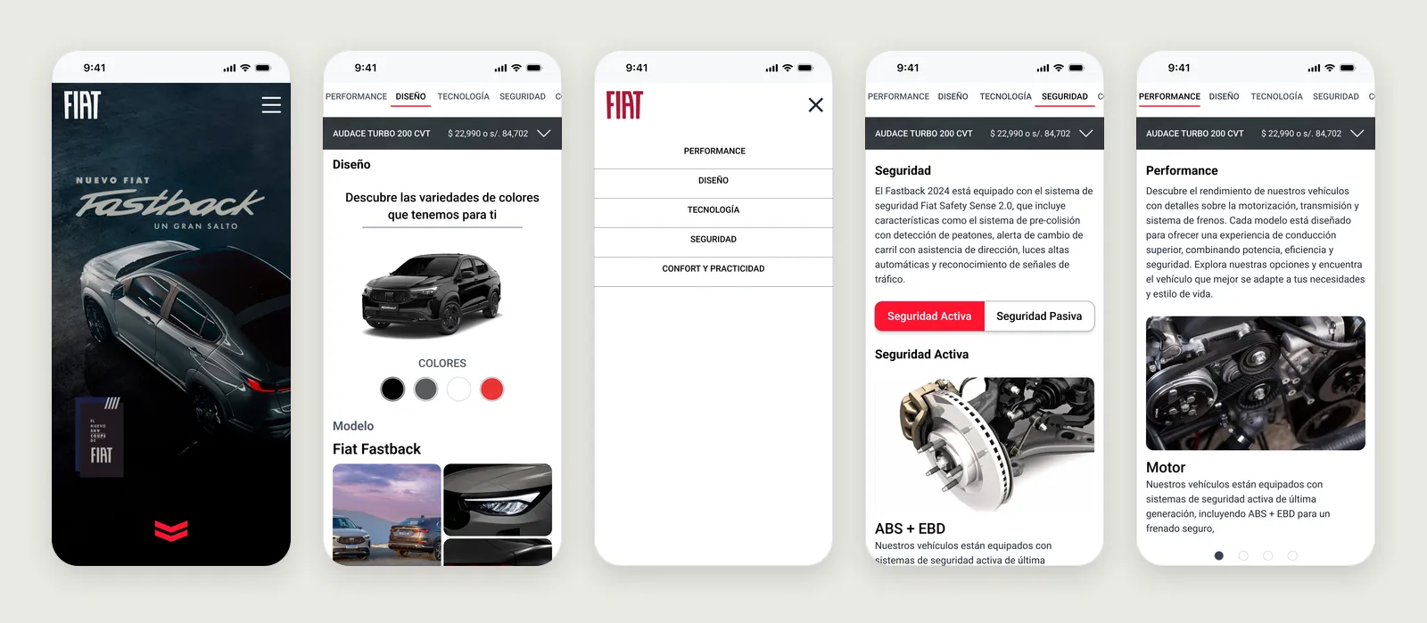
Two decisions keep it easy to use with one hand, standing next to the car:
- The section tabs and the version picker stay pinned at the top as you scroll, so jumping from Design to Safety never means scrolling back up.
- Safety splits into Active and Passive with a single toggle, instead of one long list of acronyms.
One template, three brands
FIAT, Jeep and RAM look nothing alike, but the guide doesn’t need three designs. Each brand changes only its logo and its accent colour: FIAT’s red, Jeep’s yellow, RAM’s dark red. Layout, type, the grey scale and every component are shared.
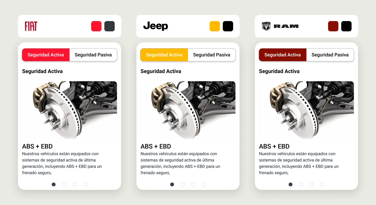
That made a new brand, or a new model, a content task rather than a design task.
A kit built for swapping content
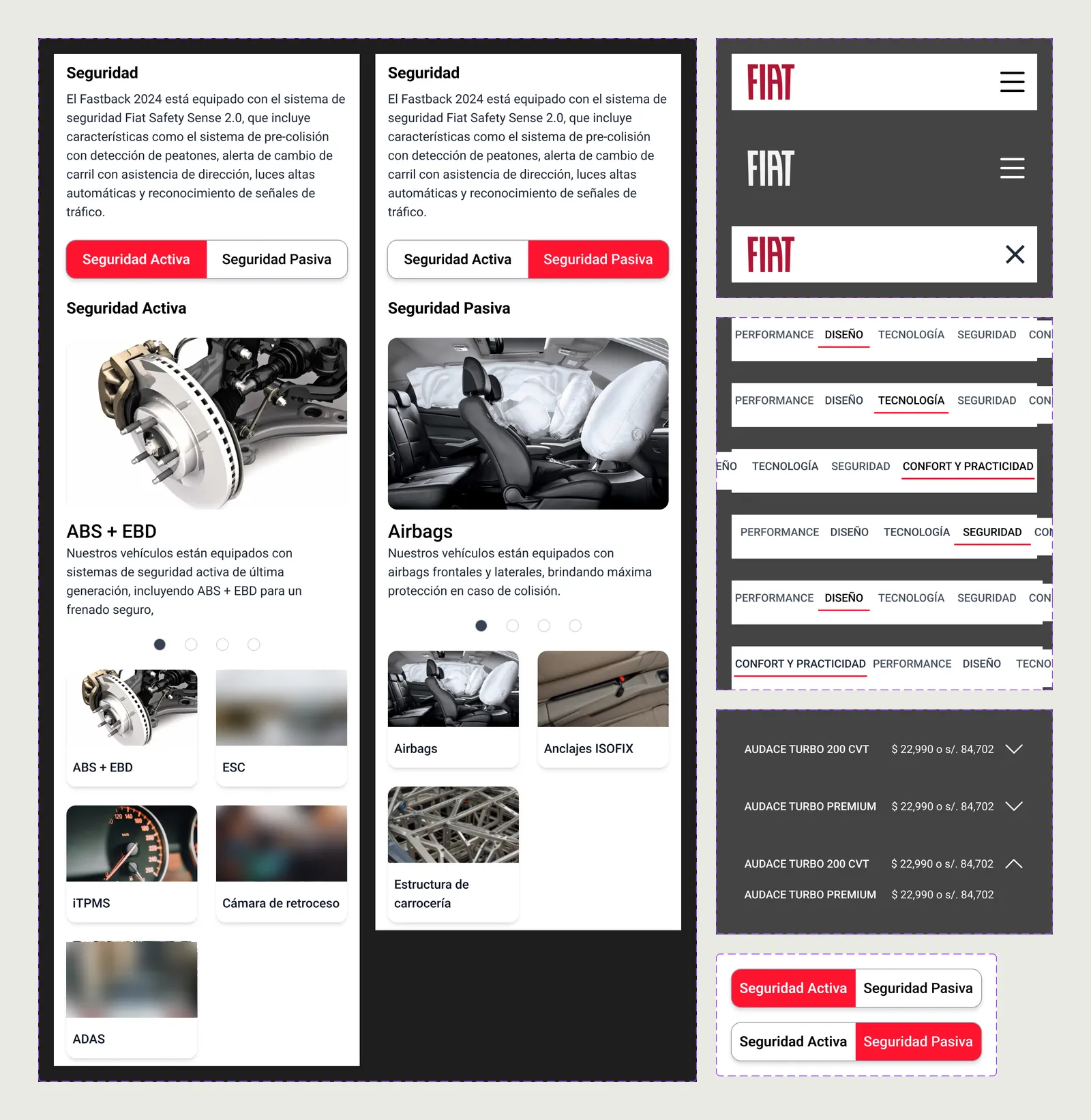
Behind the template sits a kit of 18 component sets with 70 variants: the brand header in three states, the section tabs in six, the version picker open and closed, the Active and Passive toggle, and a feature card for every section.
Where it landed
The guide was developed and used in part of the showrooms. It is no longer online, and there were no usage numbers to share, so the designs here are what remains.
- brands on one template
-
3 - sections per model
-
5 - component sets
-
18 - variants in the kit
-
70
What I learned
Check every theme, not just the first. Jeep’s white text on its yellow accent doesn’t reach readable contrast; a template has to prove each brand colour against its text, and switch to dark text where the colour is light.
I also learned how much names matter. In this kit, many components kept Figma’s default names, and finding the right one took longer than it should have. It’s why, in later work, every component and token I make has a name that design and code share.