A good idea, buried in its own menus
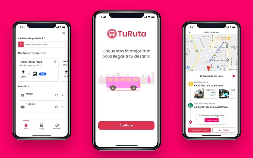
In Lima, most people get around by bus, and routes are hard to read if you don’t already know them. TuRuta answers the one question that matters: which bus takes me there?
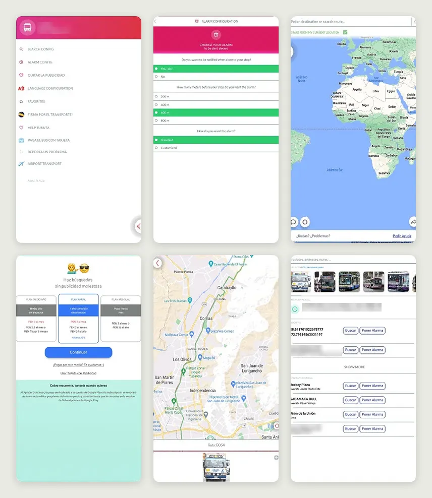
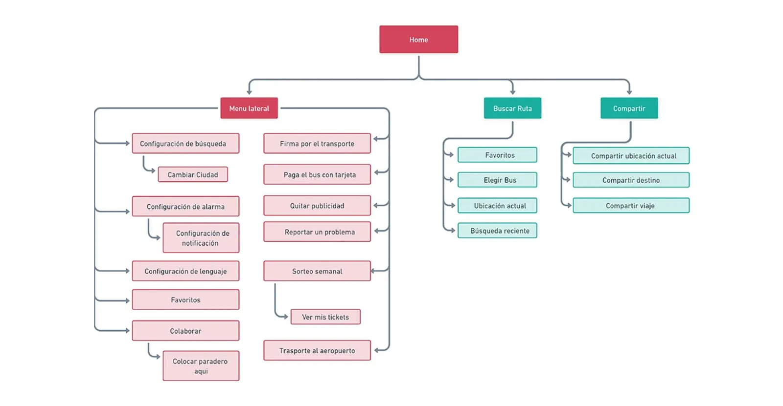
The idea worked. The app around it had grown one section at a time. Two menus offered overlapping options. English and Spanish shared the same screen. A saved place appeared as raw coordinates, and the payment section had no way out. Nobody had designed the whole; each part had just been added.
Four interviews, one rider to design for
I interviewed four students and workers in Lima who take the bus every day. They described the app as simple but disorganised, and every one of them mentioned the mixed languages. What they asked for was concrete: save the places they go to often, share their location, and know the fare before they leave.
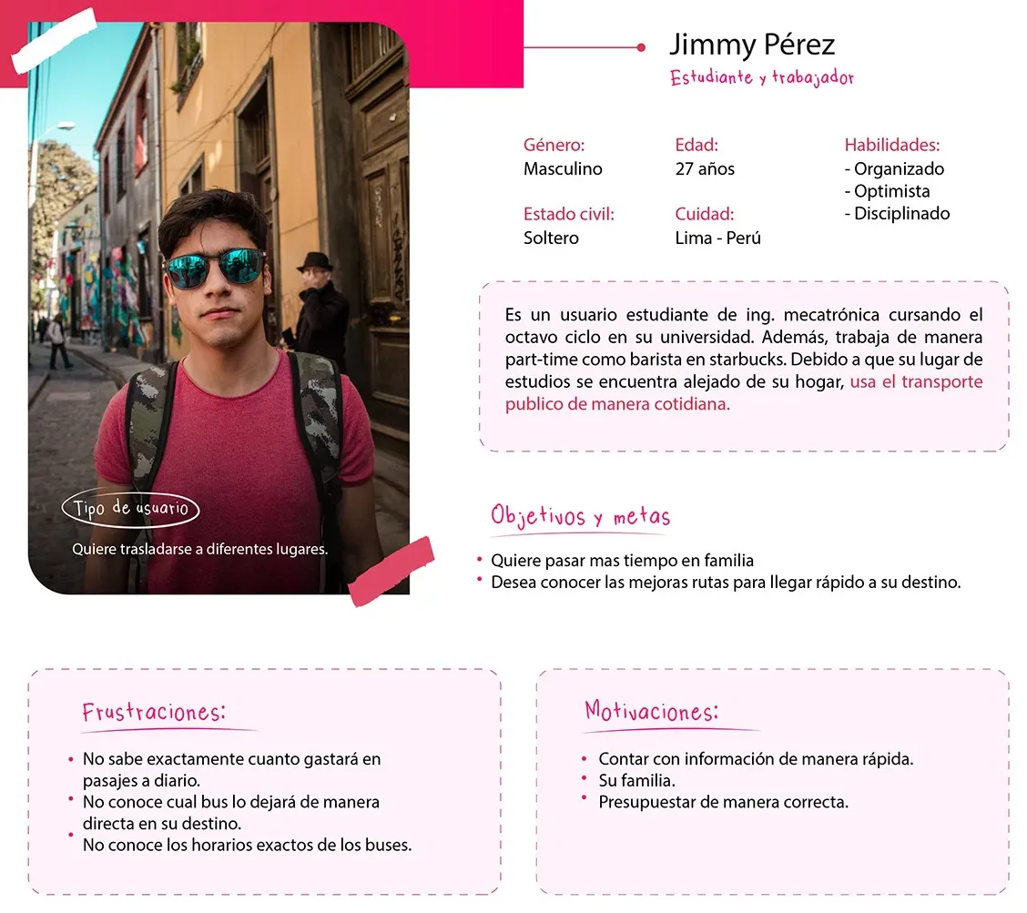
From those interviews I built Jimmy: 27, a mechatronics student who works part-time as a barista and rides the bus every day. He has three questions the app never answered well: how much will today’s fares cost, which bus takes him there without a transfer, and when it comes.
4 in 10 couldn’t find which bus to take
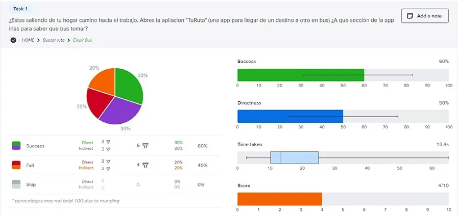
Before touching the interface, I tested the structure. In a tree test on Optimal Workshop, 10 people looked for things in the app’s existing menus, with no visual design to help or distract them.
The app’s main job failed first: 40% couldn’t find which bus to take. Changing the payment method reached 60% success, but only 20% of people went there directly. Everyone else wandered before finding it.
People sorted the app into four places
So I asked people to organise the app themselves. In a card sort with 9 participants, the groups converged on four main categories. Two of them stood on their own, plus two small sections: sharing and settings.
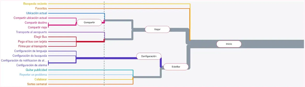
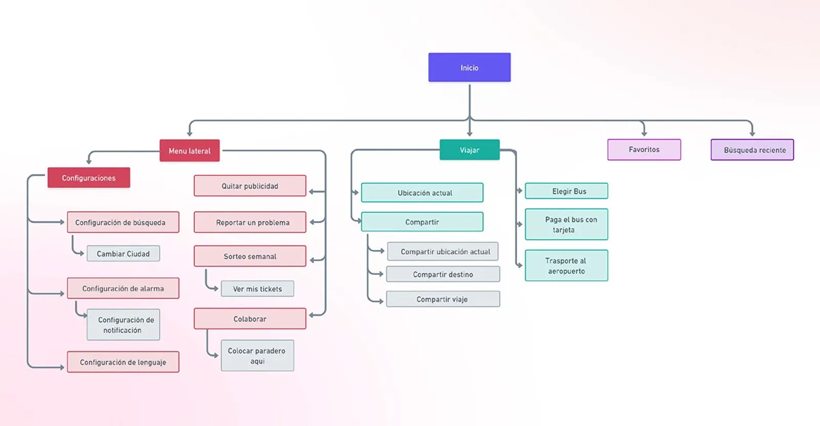
That became the new architecture. The home splits into the side menu, Travel, Favourites and Recent searches. Settings live in one place. Sharing and payment move under Travel, next to the trip they belong to. The two independent sections became floating buttons over the map, one tap away while you travel.
Drag the red line, or focus it and use the arrow keys.
Every screen gets a way back
I ranked every fix by how feasible and how wanted it was, and the first in line were the basics:
- a back button in every section;
- one language, Spanish, across the whole app;
- a menu people recognise as a menu;
- a visual hierarchy where the next step stands out;
- and nothing broken. One feature linked to a page that no longer existed, so I removed it.
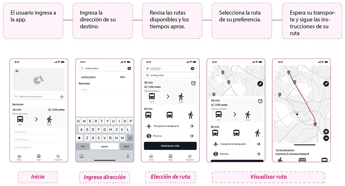
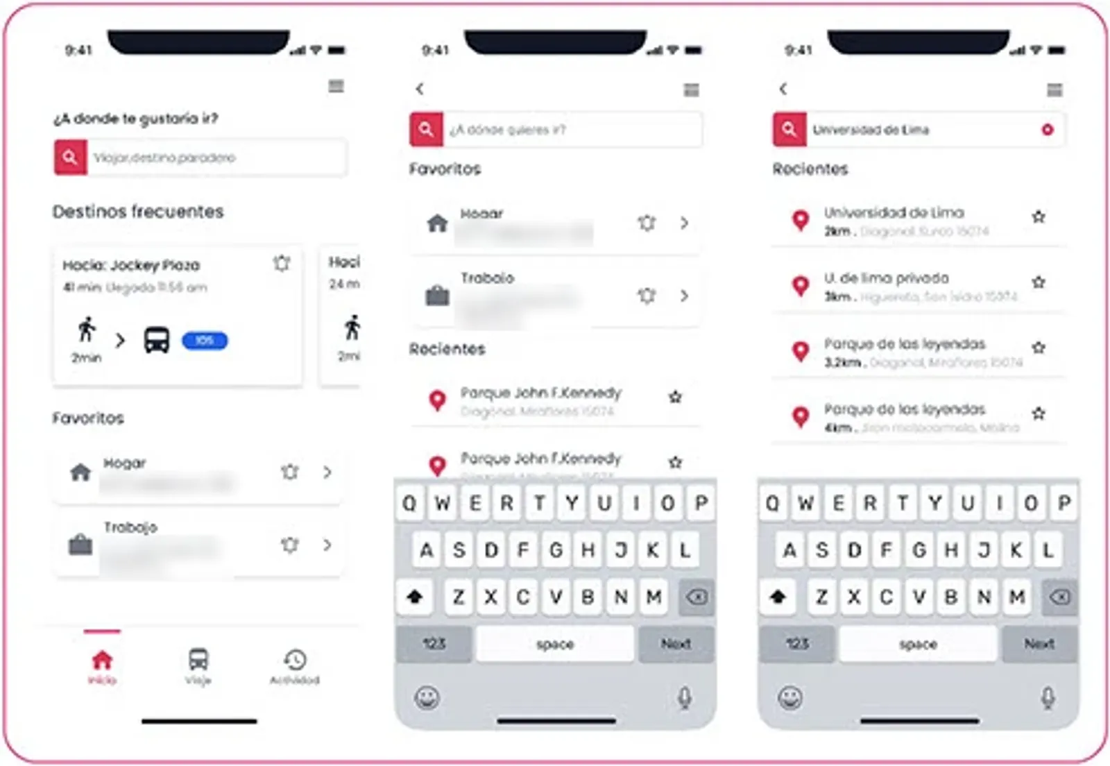
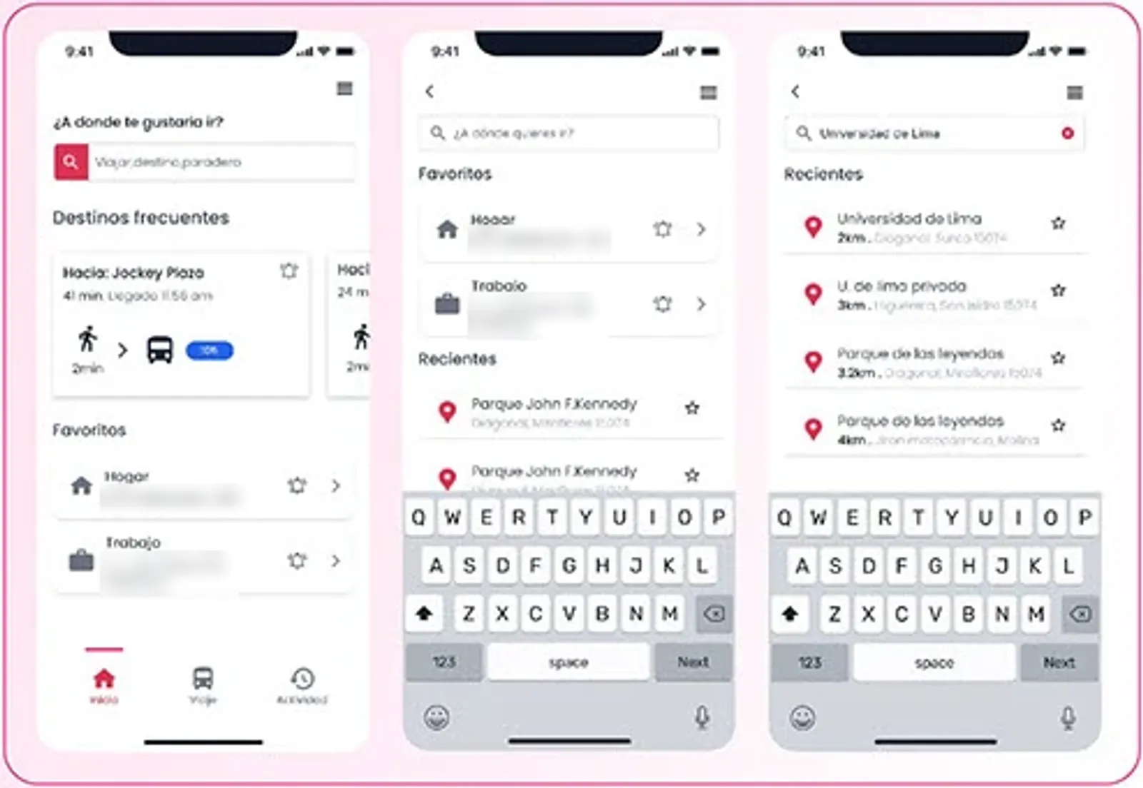
Then I drew the main task, planning a trip, as a flow and in low fidelity, to check every step had one obvious next one before any pixel was polished.
The whole trip on one screen
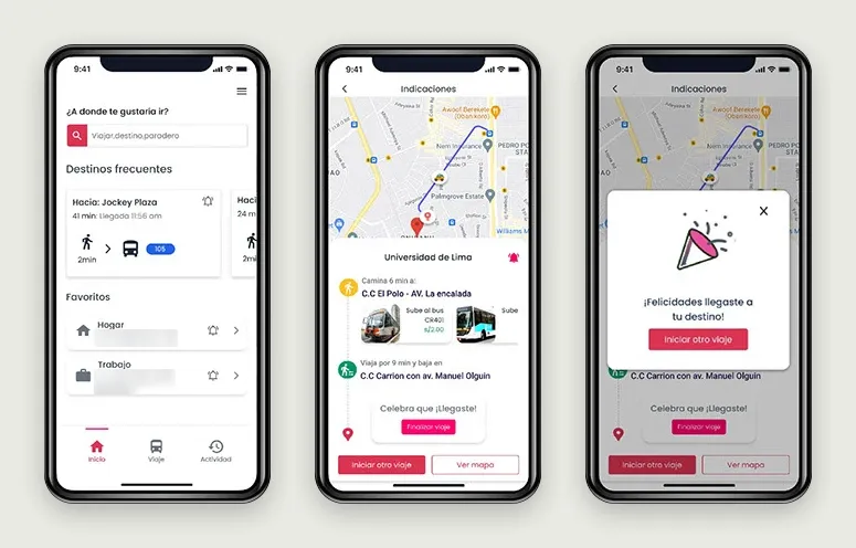
The route options answer Jimmy’s three questions side by side: how long the trip takes, what it costs and which lines to take. Once you choose a route, a horizontal slider walks you through it step by step without leaving the map, and arriving gets its own confirmation.
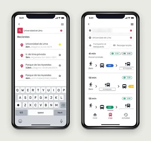
Red became the primary colour, because it reads as urgent and gets noticed on the street. I kept the app’s pink as the secondary colour, so version two still felt like TuRuta.
Four people, three tasks, two fixes
I tested the prototype remotely in Maze, with four participants on video calls. They had three tasks: plan a trip, remove the ads and set an arrival alarm. They completed 11 of the 12 attempts.
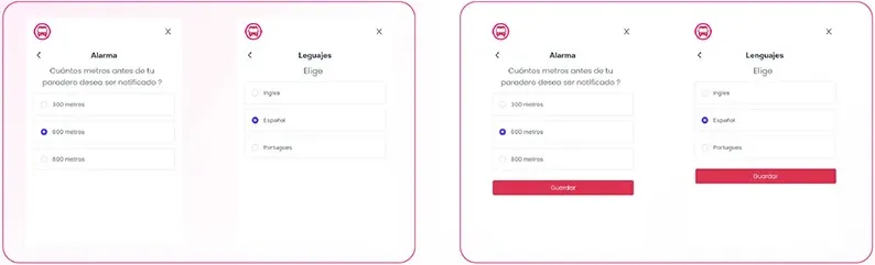
The sessions still found problems. Two of three participants noticed that the search bar looked different on each screen, and settings had no save button, so nobody knew whether a change had stuck. I fixed both in the next version.
Drag the red line, or focus it and use the arrow keys.
- couldn’t find which bus to take in the old structure
-
40 % - people in the tree test and the card sort
-
19 - of 12 tasks completed on the redesign
-
11 - fixes made after testing
-
2
What I learned
Test the old version and the new one on the same tasks. My tree test proved the old structure was failing, and my usability test showed the new one worked, but they measured different things, so I can’t put one number on the improvement. Now I run the same tasks on both, so the before and after can be compared directly.
I also learned that a redesign earns trust by keeping what people already recognise. Keeping TuRuta’s pink made version two feel like an upgrade instead of a different app.