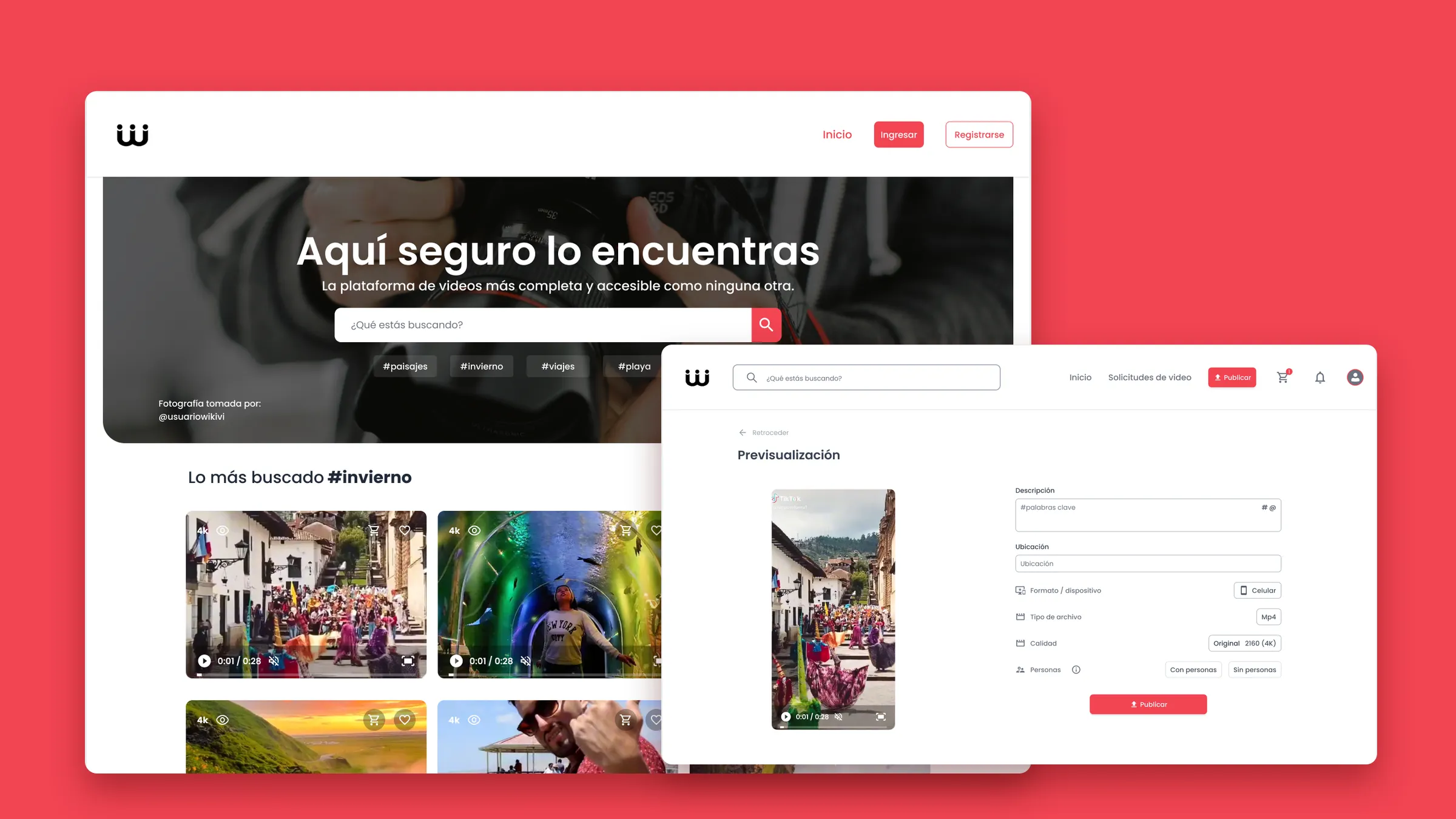
Millions of videos. None of them from here.
Stock footage platforms lived at two extremes: professional content at professional prices, or generic clips that looked nothing like local culture. For an agency promoting a restaurant in Cajamarca, neither one worked.
That’s where I saw the opportunity: a video bank made by local creators, with culture and place at its core. I pitched the idea and wrote a work plan to validate it before designing a single screen: benchmark, interviews, card sorting, flows, wireframes and usability testing.
We studied Pexels, Shutterstock and Getty Images, and interviewed 10 people to understand both sides of the problem:
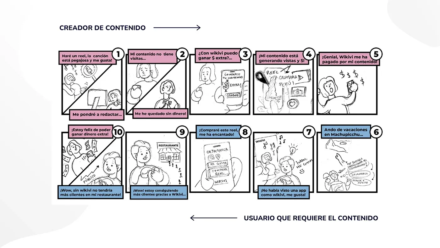
- Irene, a 26-year-old designer, had footage nobody was watching, and was afraid of it being used without her permission.
- Jonathan, a 38-year-old advertising professional, needed videos that looked like his clients’ audiences, without expensive or restrictive licenses.
Two products under one roof
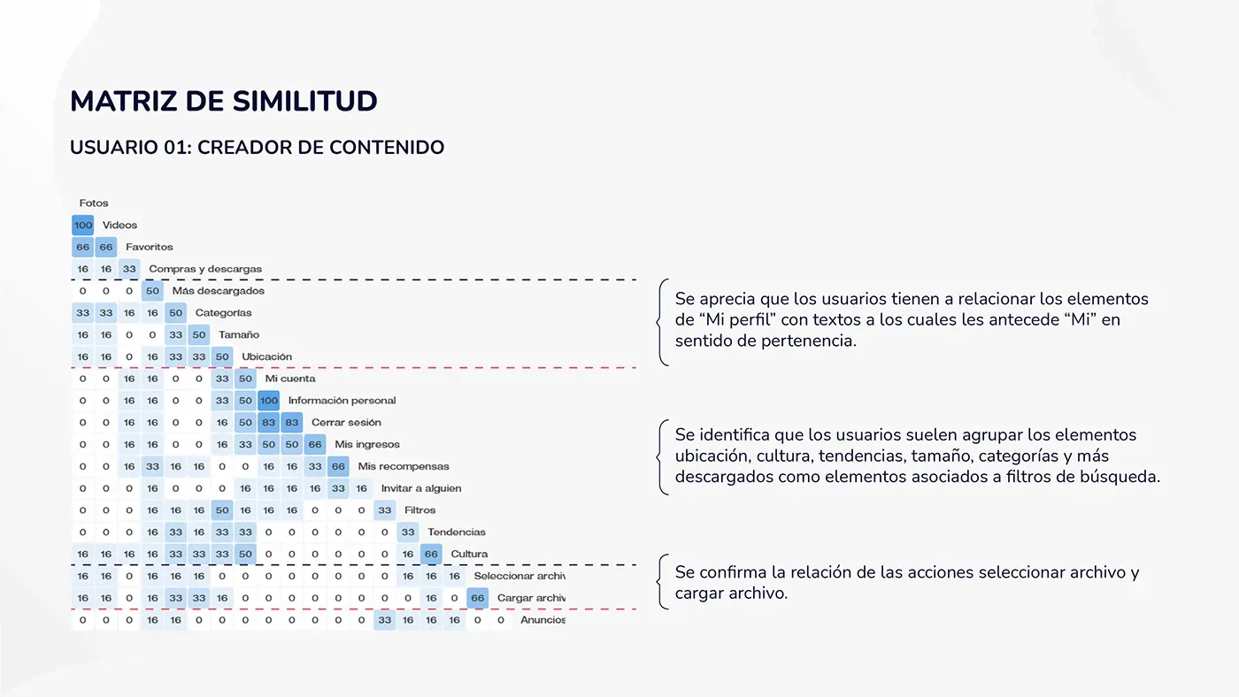
Creators and businesses wanted different things: one side wanted to upload and get paid, the other to search and buy. The easy answer was two products. A card sort with 5 creators and 5 businesses pointed somewhere else.
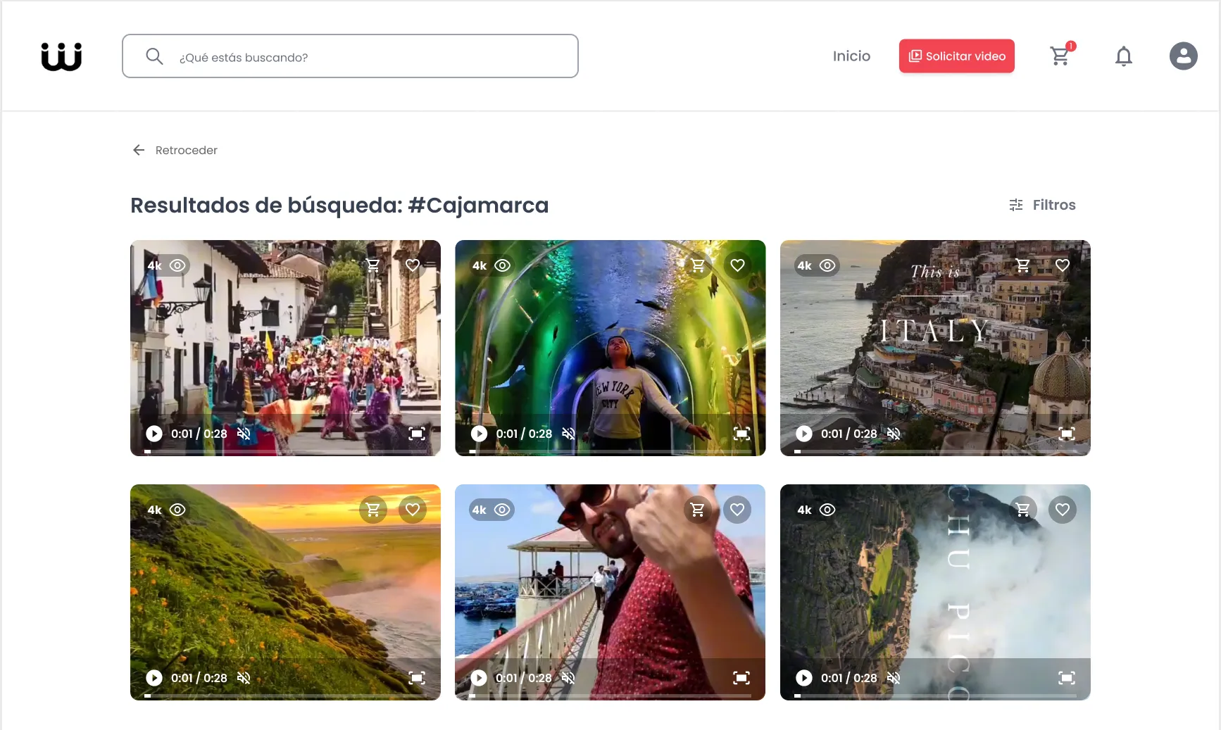
Participants grouped location, culture and trends together with the search filters. Culture wasn’t just another category: it was how people searched. So every video shows where it was shot, and the filters start from there.
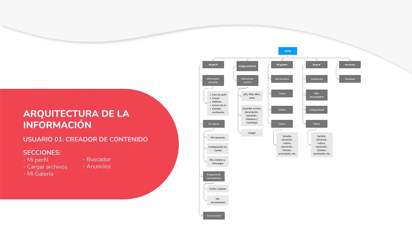
I unified the vocabulary across both information architectures, so switching roles didn’t mean learning a new product, and cut the main sections from 6 to 5 for creators and from 7 to 5 for businesses.
If the video doesn’t exist, let them ask for it
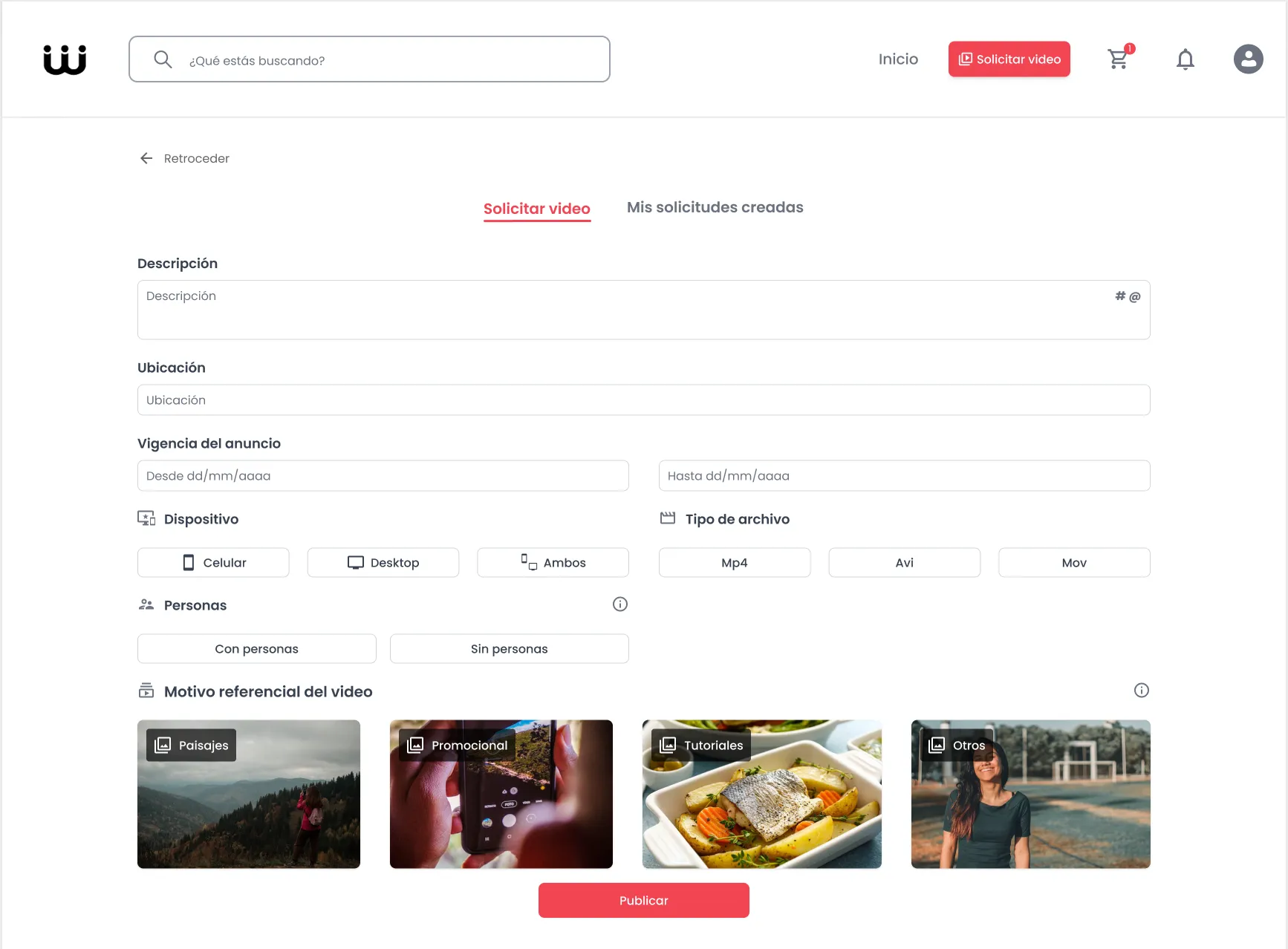
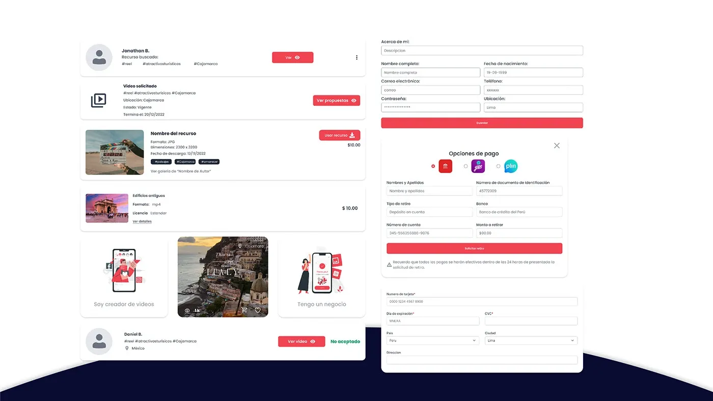
On a regular stock site, if you can’t find what you need, you leave. My idea was to turn that failed search into a commission. The business posts a brief (description, location, deadline, device, format, and whether people should appear), creators send proposals, and the business picks the one that fits.
What testing broke
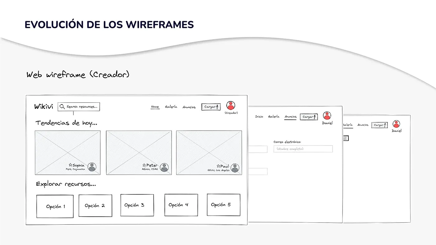
We tested the prototypes with both roles, on desktop and mobile. Creators finished every task on mobile, but on desktop there were two tasks nobody could complete. Businesses took longer on desktop and got stuck on two tasks too.
The biggest finding was a single word. We called the request section “Anuncios” (Ads), and both user types took it for advertising.
There were other stumbles: the floating “+” button on mobile blended in with the home feed’s videos, and the preview of a creator’s proposal had no way to add it to the cart.
Changing one word changed the core feature
I renamed the section “Video requests” for creators and “Request a video” for businesses, and moved it to the most visible spot in the header. Testing had already told us that the ability to ask for a specific resource was what users valued most.
In the same round, we made the upload button permanently visible and in color, muted video previews by default, and replaced the jump straight to checkout with a confirmation offering “view cart” and “keep shopping”.
One video, every screen
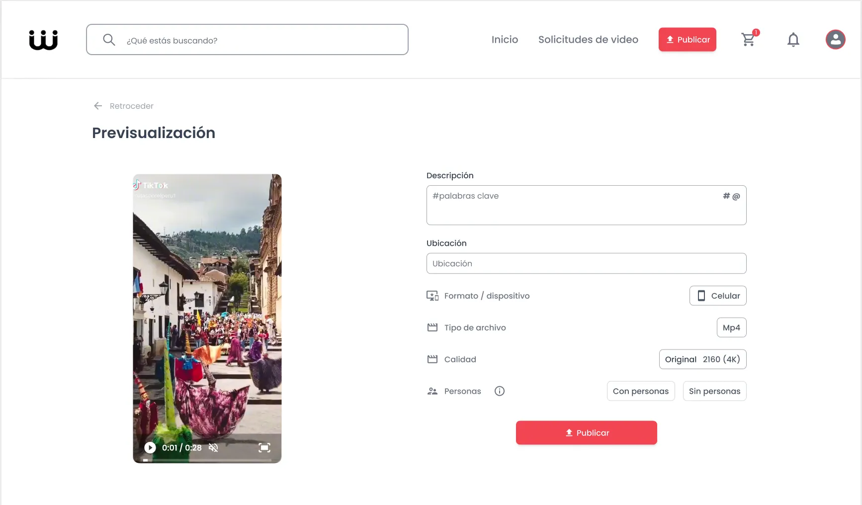
Every request brief already asked which device the video was for: phone, desktop or both. But creators uploaded a single file, and a horizontal clip forced into a reel loses exactly what made the shot worth buying.
For the next version of the web app, I designed a format step for both publishing and downloading. The creator decides which part of the video shows in vertical and checks it on a phone before it goes live, and the business downloads the format it asked for, with no editing needed.
Drag the red frame, or focus it and use the arrow keys.
A system so three designers sound like one
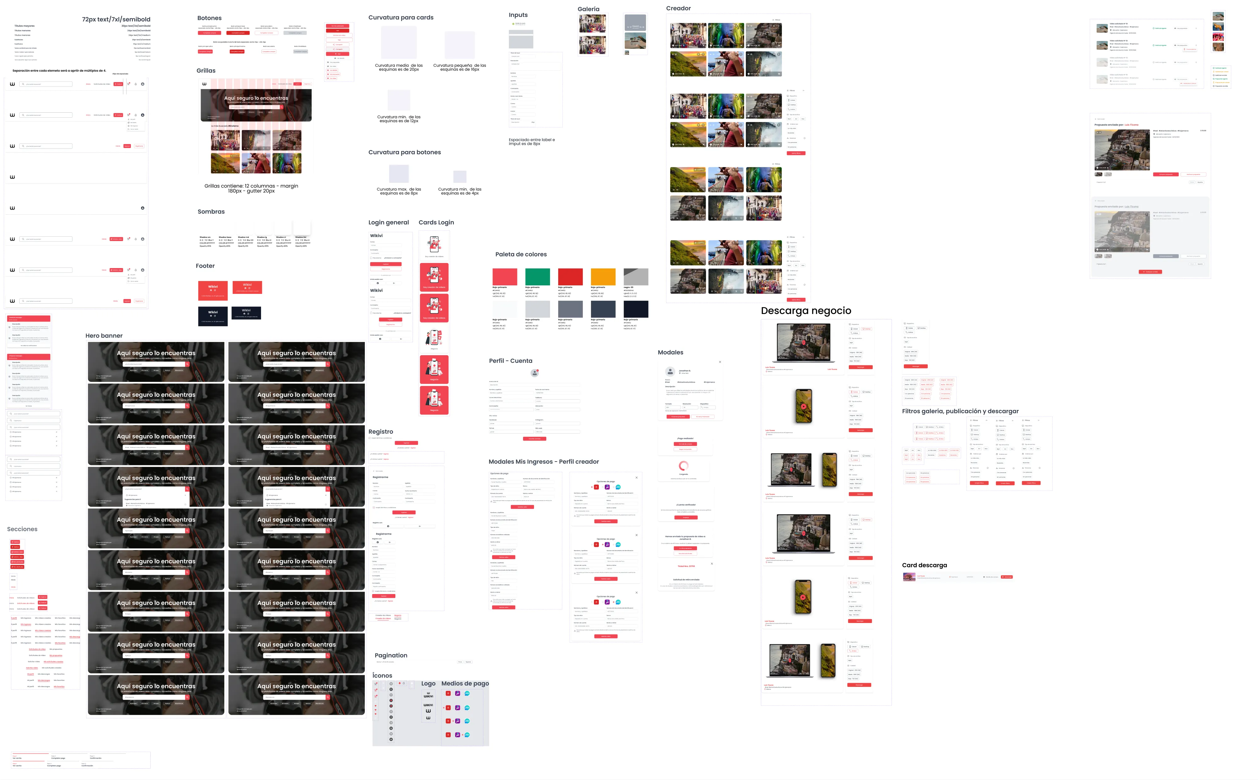
With 100+ desktop screens and three people designing in parallel, consistency couldn’t depend on memory. I led the design system in Figma using Atomic Design: from color and type up to components unique to this product, like request cards and their states (open, sent, accepted, declined), the role picker, and payouts through Yape and Plin, Peru’s most popular mobile wallets.
I always designed with the dev team in mind. That’s why colors and the type scale follow Tailwind’s naming (gray-900, text-sm to text-5xl): design tokens and code tokens share the same names, so handoff wouldn’t need translating.
What we validated
- interviews to define the scope
-
10 - creators and businesses in the card sort
- 5 + 5
- rated the desktop experience pleasant or very pleasant
-
86 % - desktop screens built on the system
-
100 +
I handed the client the complete design: user-tested flows, 100+ desktop screens and a design system ready for development.
Beyond the numbers, the lesson was clear: people didn’t just want a catalog of their culture, they wanted to be able to ask for it. That feature went from a badly named tab to the center of the product.
What I learned
Words are interface. “Anuncios” was well designed and badly named, and no amount of visual polish was going to fix it; only putting it in front of real users could show us. Since then I test labels as early as I test layouts.
I also learned that leading is mostly planning. The work plan I wrote at the start (research, structure, test, and only then polish) is what gave the team room to change course while it was still cheap. Today I protect that second round in every project, because it’s where the product gets right.